

VCA
Redefining the Vegetarian Consumers Association with a mobile-first design

Project type: Concept
Team: Solo
Sprint time: One week
Project summary
Problem
The original website desperately needed a complete overhaul in terms of UX design principles. It craved a generous injection of order and functionality to bring it up to par.
My role
Process
Desk research was conducted to determine the target audience for the website. Discovering the users needs, wants, and reasons for visiting informed the UI structure and visual design.
Embracing a mobile-first approach and establishing a distinctive visual identity.
Solution
I developed a solid visual identity that resonates with the audience and reflects The Vegetarian Association's mission.
Impact
The revamped website would serve as a valuable resource for the targeted audience, driving the association's mission forward with efficiency and style. This vividly illustrates the immense power and importance of UX and UI design, highlighting their crucial role for every online business or charitable organization.
Planned and conducted desk research alongside competitive/comparative analysis
Created sketches and designed wireframes
Iterated the design to produce high-fidelity wireframes
Created a component library using atoms, molecules and organism structure

Intro
Who are the Vegetarian Consumers Association (VCA)?
The Vegetarian Consumers Association (VCA) is a non-profit organisation connecting vegetarian consumers with smart businesses and providing free expert consultation to those that want to appeal to a large number of vegan/vegetarian consumers.
The VCA's current website is a prime example of bad UX. It demonstrates difficult navigation, unclear instructions, and a complete lack of mobile-friendliness. Oh, and get ready for some real fun; when you innocently click on a navigation title, you find yourself in a surprise PDF download!


Logo/illustration
I get it; every business wants to make money. But this icon is incredibly literal and needs to convey more meaning and purpose.
The letter spacing adds too much white space between the letters, which makes it difficult to read. Highlighting the URL ‘Veg Consumer’ makes it fail colour contrast measures and makes the odd ‘s’ stand out and look strange.

Navigation
Jacobs Law tells us that users expect certain website behaviours to be the same. People don't expect a Nav title to download a PDF when clicked! (I can’t tell you how often I accidentally did this during my analysis!)

Headlines
The Capital letters makes it hard to read and appears aggressive in tone

Links
Using the standard HTML styling shows a need for more attention to detail. One link isn’t blue. Does this signify another meaning, or have they made a mistake?
Discovery
Due to budget or time constraints, it’s not always possible to conduct user interviews, so desk research and the company's Facebook page provided valuable information and context.

Key vegetarianism and veganism insights

“One in five 18-to-24-year-olds are flexitarian, one in 10 are vegetarian and five per cent are vegan.”
Viva.org.uk

“Where only 2.5% of Americans over the age of 50 consider themselves vegetarian, 7.5% of Millennials and Gen Z have given up meat. The same goes for veganism, where the younger generations have taken on the diet at nearly double the rate of older Americans.”
Published by Nils-Gerrit Wunsch, Jan 27, 2022
The website clearly needs modernising, but what does ‘modern’ mean to you?
It is possibly very different to my understanding of the word. My initial research enabled me to distinguish a logical target audience. With this information, I felt it appropriate to position them as serving businesses that either already do or want to appeal to a vegetarian / vegan youth culture (18–30 Genz/millennials). (Don’t worry, I don’t just stick with a demographic, the psychographics comes later in my persona!)

Competitive and
comparative analysis
I started looking for UI inspiration, brands, and companies that effectively disrupt this Vegan space and cater to this demographic.
I also looked at insight, research, and consultancy companies, as The Vegetarian Consumers Association audience needs to perceive them as a thought leader in this space.


Visual design brief
What are we making?
A marketing focussed homepage for The Vegetarian Consumers Association. It needs to inspire, delight and inform business owners (restaurants and product makers) about the thriving vegan and vegetarian market offer.
Why are we making it?
To build awareness of our mission: to make vegans/vegetarians options more easily available for everyone.
We want to also build awareness of our free consultancy services whilst also increasing donations and with a future plan to approach brands for sponsorship. All funds raised help to supplement the free consultancy service, insights and events.
Problem we’re solving
Introducing vegan and vegetarian options onto a business model is often perceived as unnecessary overwhelming and expensive.
We provide free advice on how to implement small change; effectively and sustainably. Our advice and knowledge is based on solid consumer insights and learning from successful businesses.
Unique Sales Point
We’re here to demystify the vegan and vegetarians landscape offering consumer insight, inspiration and support for new and established businesses, who are looking to tap into this thriving market.
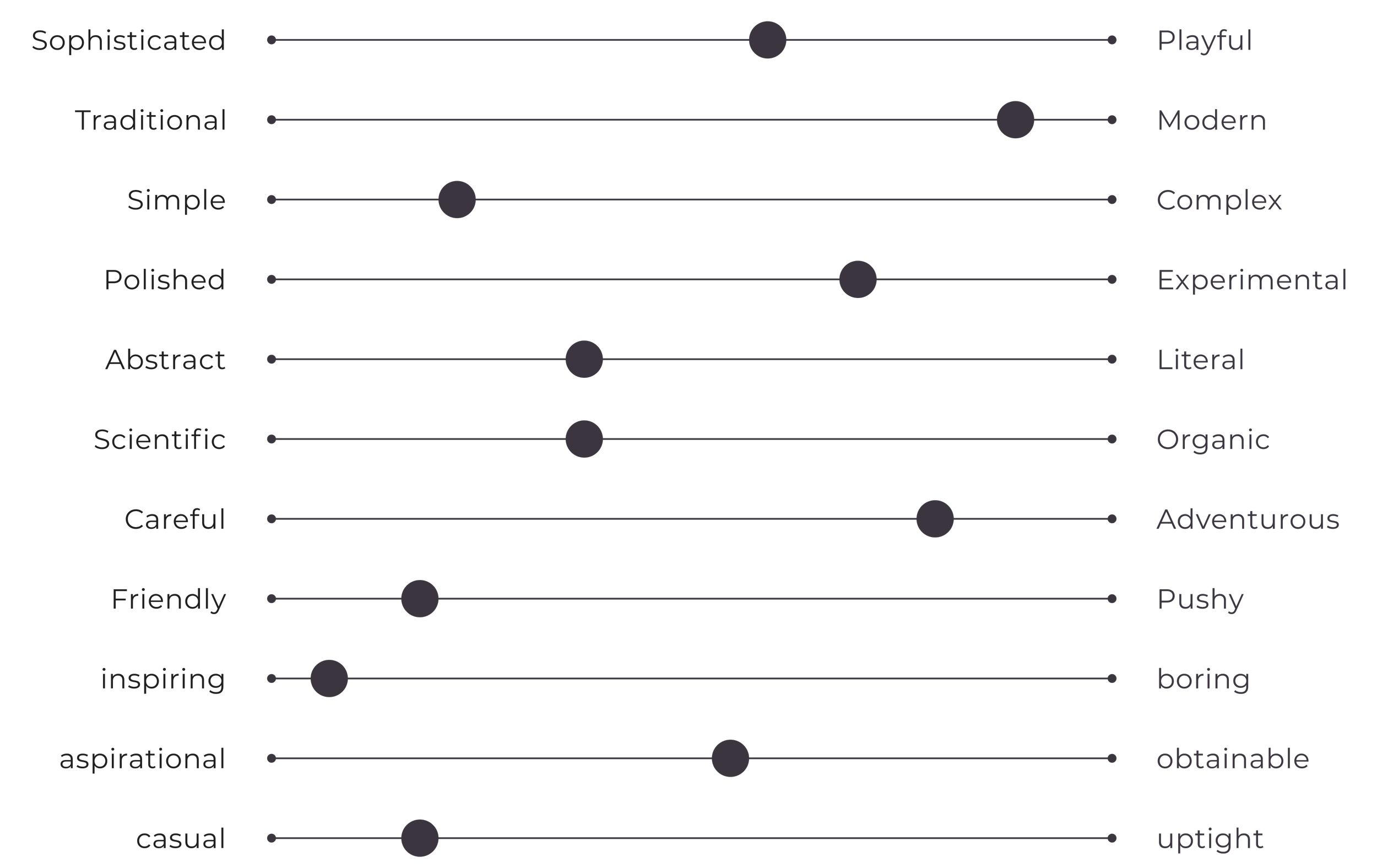
If this charity were a person, what would they be like, and how would they express themselves?
Thought leaders, bold, friendly, and modern. Inspires, delights and informs business owners (restaurants and independent FMCGs) about the thriving vegan and vegetarian market.
Persona
Darcy, the restaurant owner, wants to diversify the vegetarian and vegan options. They need a consultancy firm to provide tailored advice for seamlessly adapting the menu. Their main challenge is ensuring efficient adaptation for the kitchen staff.
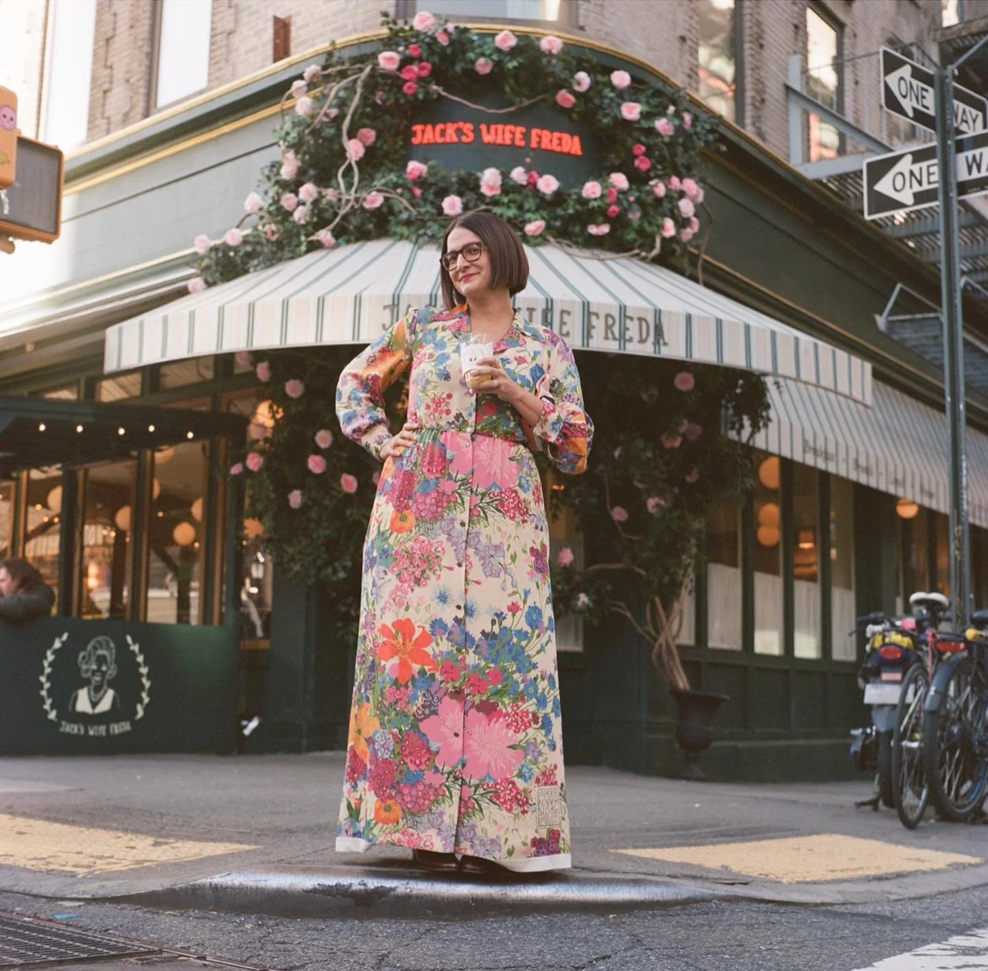
Jack's Wife Freda is known for its warm and welcoming atmosphere, where staff and servers have fun alongside customers. The menu reflects our childhood experiences in Israel, South Africa, and New York, showcasing Jewish food and culture. It focuses on fresh ingredients and beautiful presentation.
Visual persona


Design
UI mood board – Fun food


Typography

Barlow condensed offers structure and authoritative voice

Pared with Montserrat brings a calm and friendly tone
Colour palette


Site map


Wire frames
Low-fi

Mid-fi

Using contextual copy at this stage is incredibly helpful. I see it as trying to sing a song without words - you don’t know what emotion or message you're trying to convey. Ideally, I would work alongside a Copywriter or UX writer, but as this was a conceptual project with no budget, ChatGPT served as an excellent tool at this point.
Mid-fi to Hi-fi design iterations

Logo development
I also adapted the logo – not wanting to turn this into an entire project, I set a strict time box of 3hrs.

Given the business's consumer-centric nature, I explored creating a character or face using fruit and vegetables, resulting in a youthful and straightforward representation.

I played around with the idea of using the acronym as the icon. Despite using a playful typeface, the letters' weight tends to get lost within the black dot.

I was still interested in exploring the character or face, so I decided to experiment with the VCA letters, positioning them to resemble eyes and a mouth.

By tilting and resizing the letters, I infused a sense of personality into the letters. The resulting visual identity exudes youth, fun, and playfulness. This logo could be brought to life through simple animations, adding a wink or speech for even more charm and expressiveness.

