

Unplex
Building a new-age payment experience using WhatsApp
Project type: Client
Team: Four UX designers
Sprint time: Three weeks
Project summary
Problem
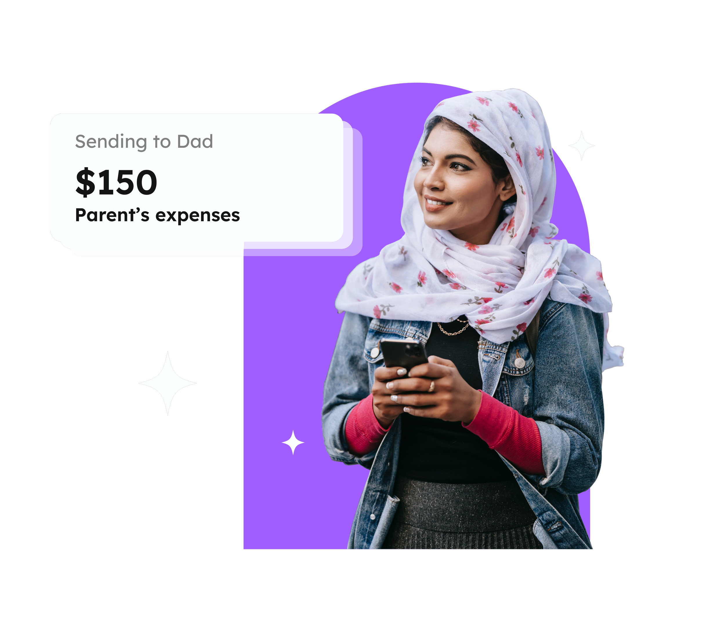
The app's mission is to eliminate the pain points of international transactions by utilising user's phone numbers instead of bank details.
Process
The project was split into two UX design sprints.
Sprint one: Review, assess and test their existing WhatsApp-integrated feature.
Sprint two: Conduct user interviews to explore the process of cash gifting. Use these insights to enhance the existing app design.
Solution
Sprint one: Users need to use the WhatsApp chatbot to send money as quickly and easily as possible. We improved the UX writing and prioritised information based on this need.
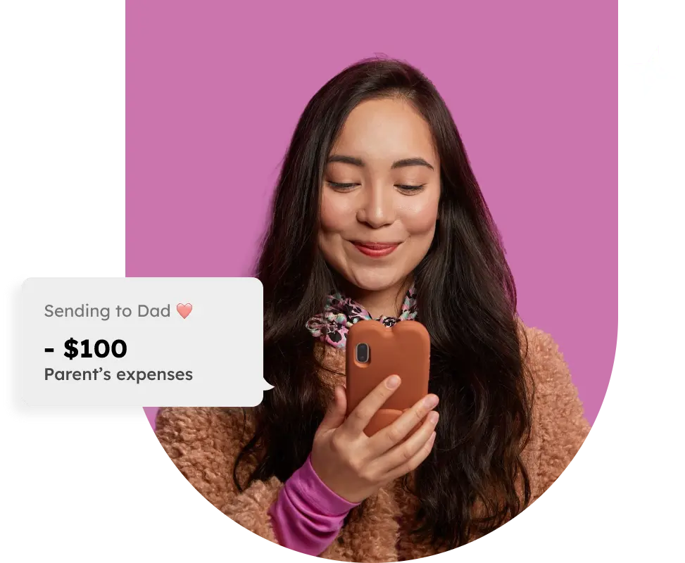
Sprint two: We discovered that international users miss cash gifting in person – the excitement and tradition of the physical experience. We designed and tested a personalised gifting feature.
Impact
Sprint one: We simplified the experience for the user, reducing the WhatsApp flow content by 1/3.
Sprint two: We validated the desirability of the gifting feature. Users agree it helps replicate the surprise, joy and excitement of receiving cash in real life.
My role
This project involved collaborating with three other UX designers. My specific contributions included:
Facilitating all client meetings, agenda-setting, leading icebreaker activities, and guiding discussions on relevant topics
Sourcing and conducting relevant user interviews
Competitive analysis
Detailed user flows for the current and recommended WhatsApp flow
Sketches and wireframes
User testing and synthesising results as a group
UI audit and Hi-fi design
Kick off meeting
Given the choice, I always opt for in-person kick-off meetings, especially when my team and client(s) are meeting for the first time. However, practical constraints often come into play. Take our Unplex clients, for example, the team is geographically dispersed across India, New York, and the UK.

As the facilitator, I guided the discussion online, ensuring that all relevant topics were covered, and encouraged open communication between my team and the three client members. I also included a fun icebreaker activity. It not only sets a positive tone for our kickoff but also helps everyone relax and encourages creativity by creating a friendly, open atmosphere for our work ahead.
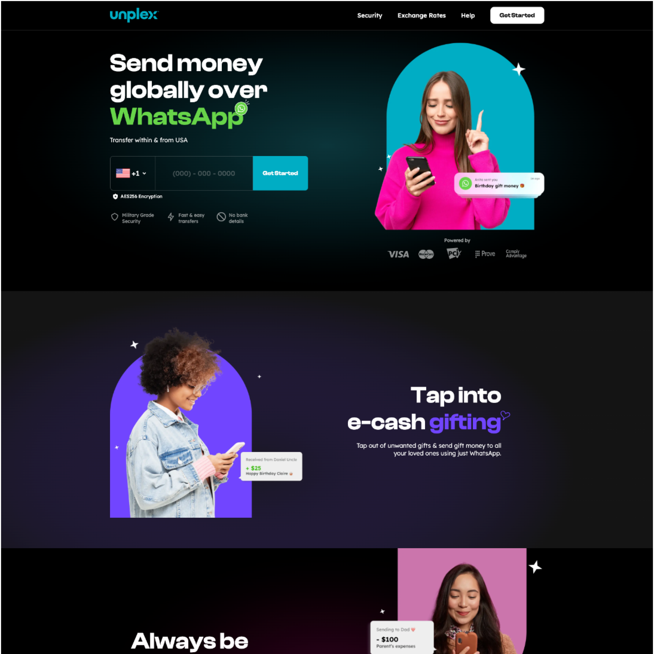
During this meeting, we discovered that WhatsApp is the most used app globally, especially in India, with over 530 million active users. Unplex had shifted their focus away from developing a native app and decided to concentrate on integrating a feature within WhatsApp. This move was aimed at leveraging WhatsApps user base and capitalizing on the convenience of sending money, encouraging spontaneous transactions.
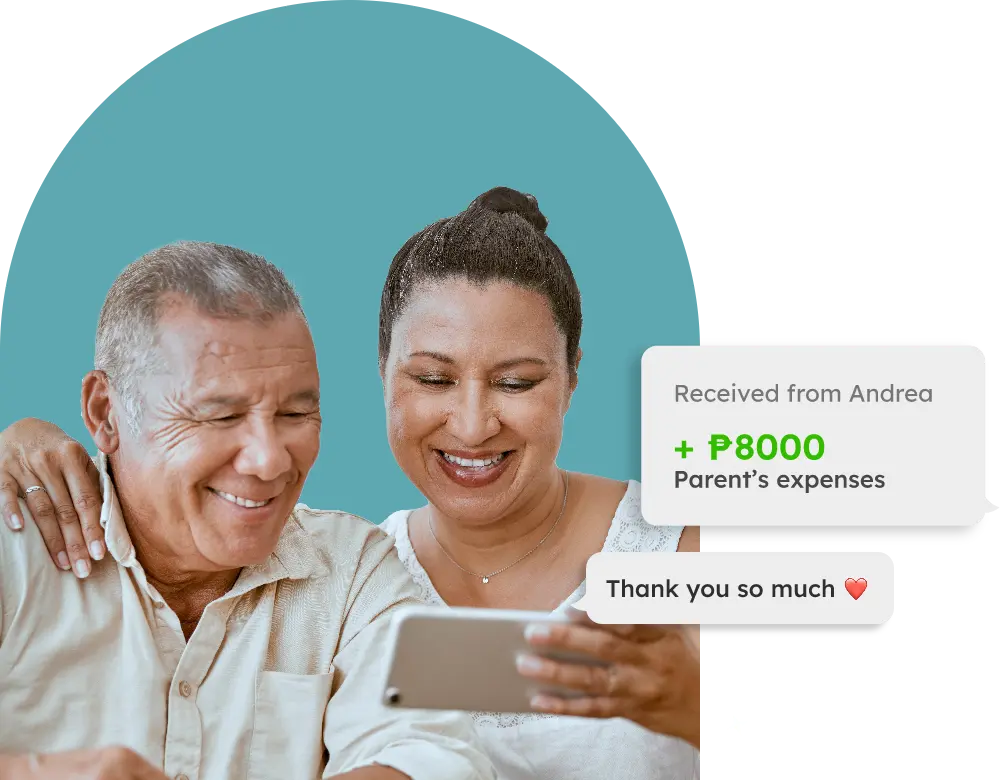
Considering the emotional significance of cash gifting in Indian culture, we discovered that our clients aimed to create a product that fosters a sense of community beyond a mere mobile banking transaction or platform. Furthermore, we identified building trust as the utmost priority in the process, emphasising its crucial role in the overall objectives.

Discovery
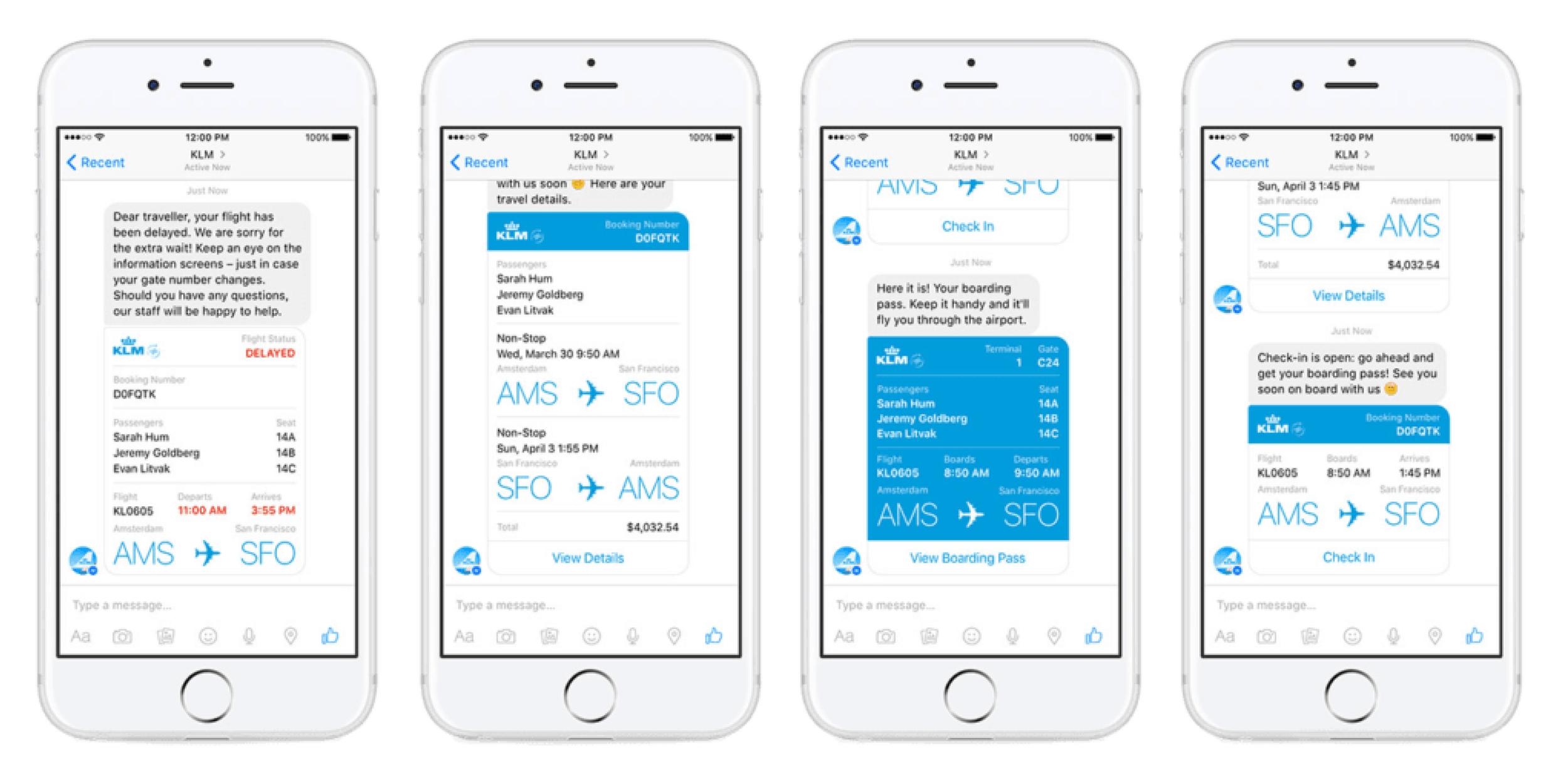
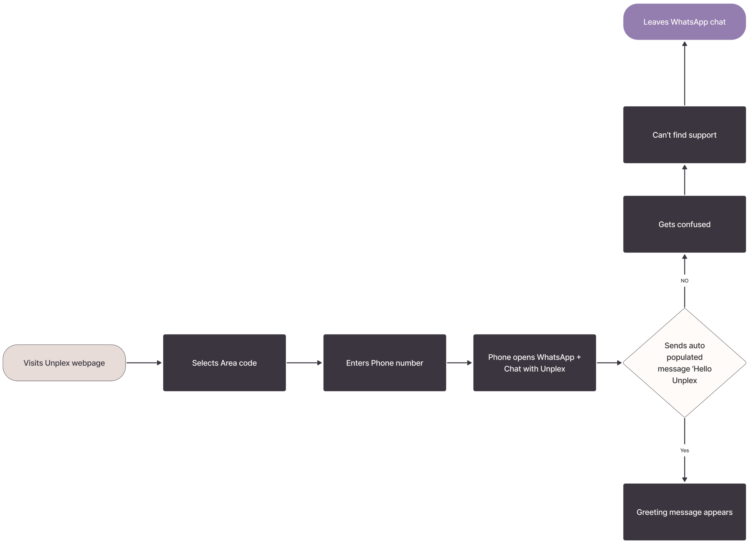
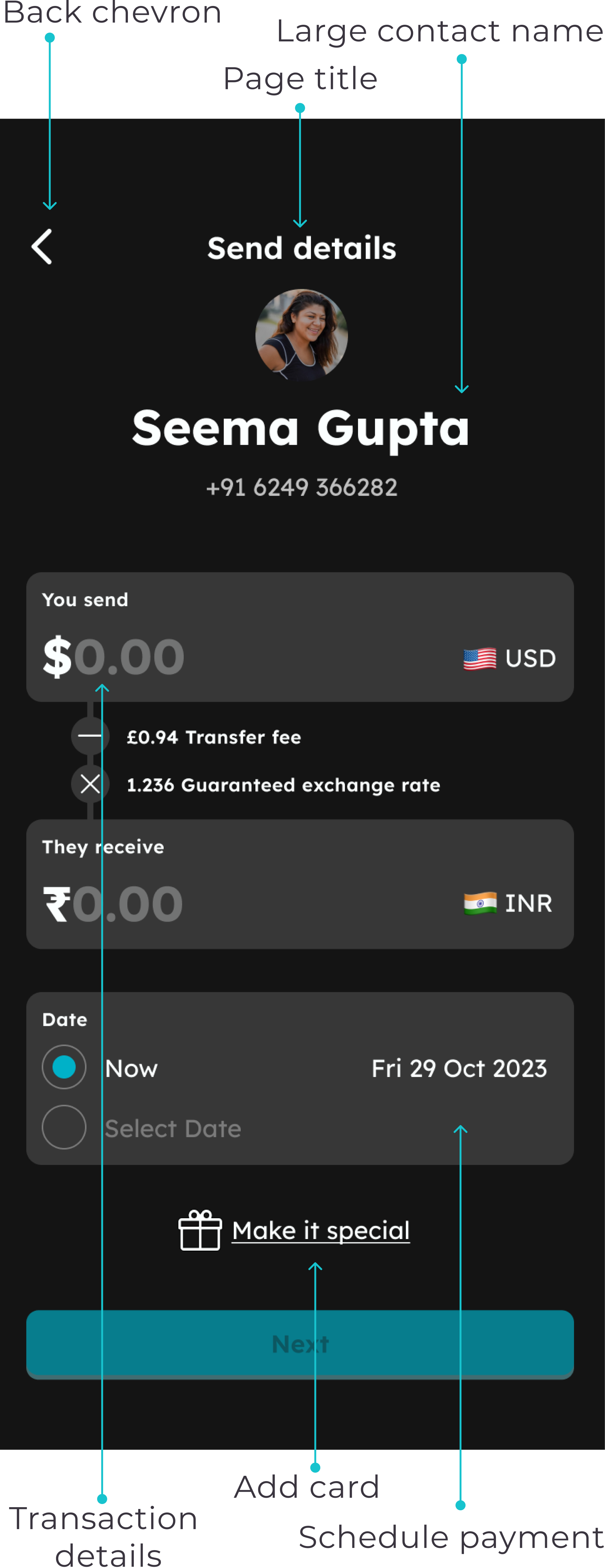
WhatsApp flow – Teardown workshop
To create an effective solution, it's important to first understand the problem. We achieved this by conducting a thorough analysis of every message within the WhatsApp flow. This analysis involved assessing the content, context, and timing to determine the effectiveness of the communication.
Additionally, we considered general chatbot design patterns, especially those relevant to WhatsApp for Business, to ensure our solution works seamlessly within the platform's limitations.
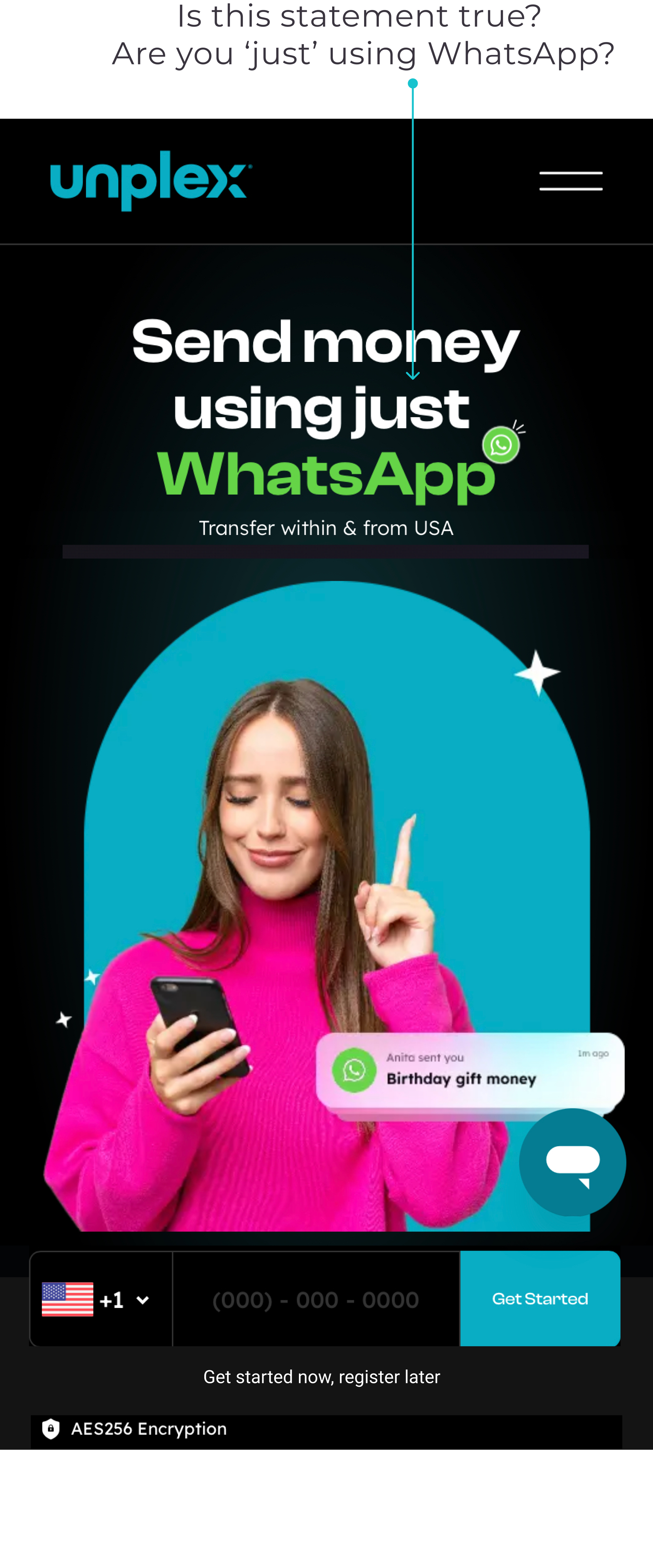
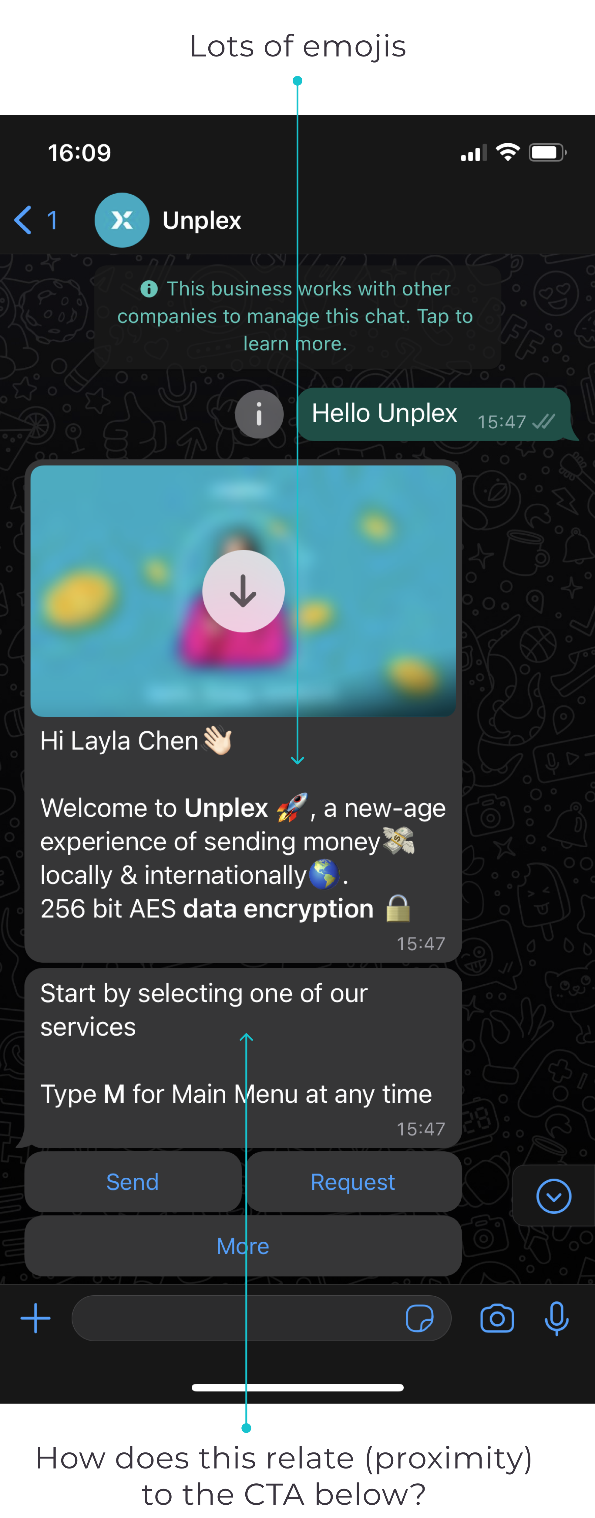
In the welcome message, we noticed an excessive use of emojis that doesn't provide significant value. Additionally, the arrangement and sizing of the CTAs (more, send, and request) could create confusion regarding the hierarchy.
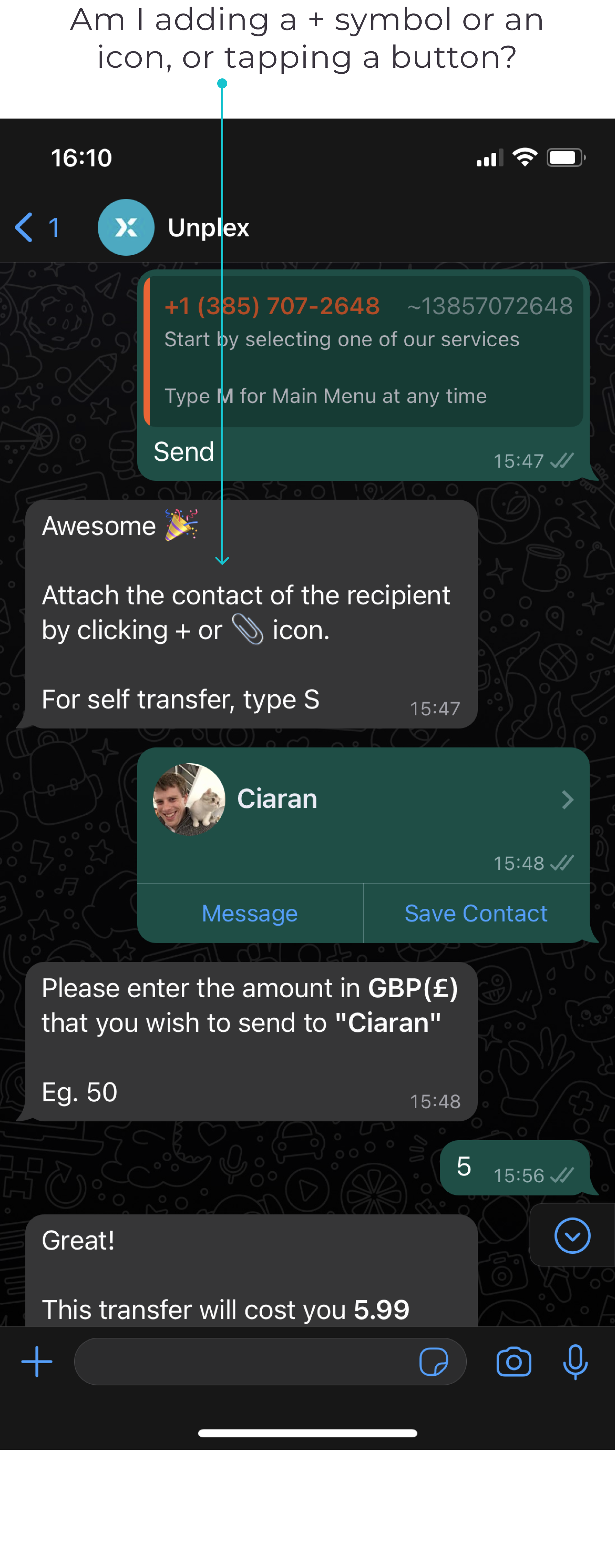
The icons used to ‘attach a contact’ could also cause confusion, especially for users who are less familiar with WhatsApp. Making the icons more intuitive would improve the overall user experience.
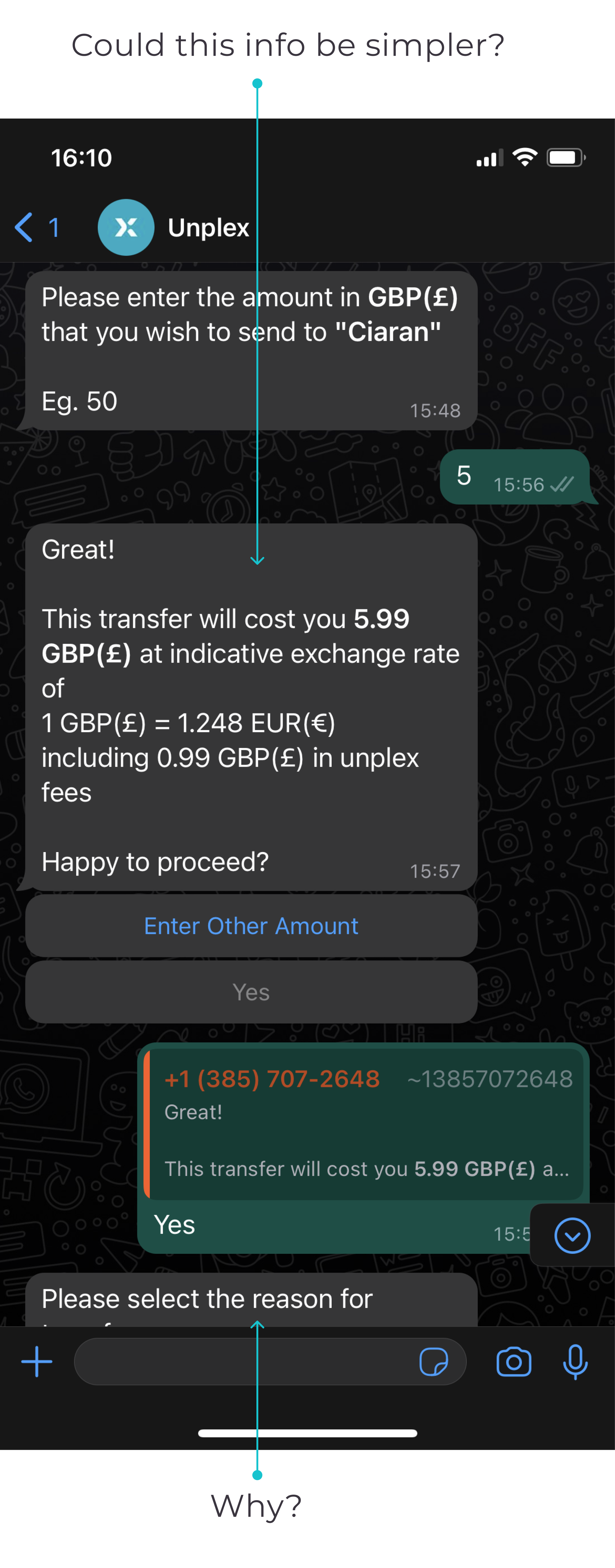
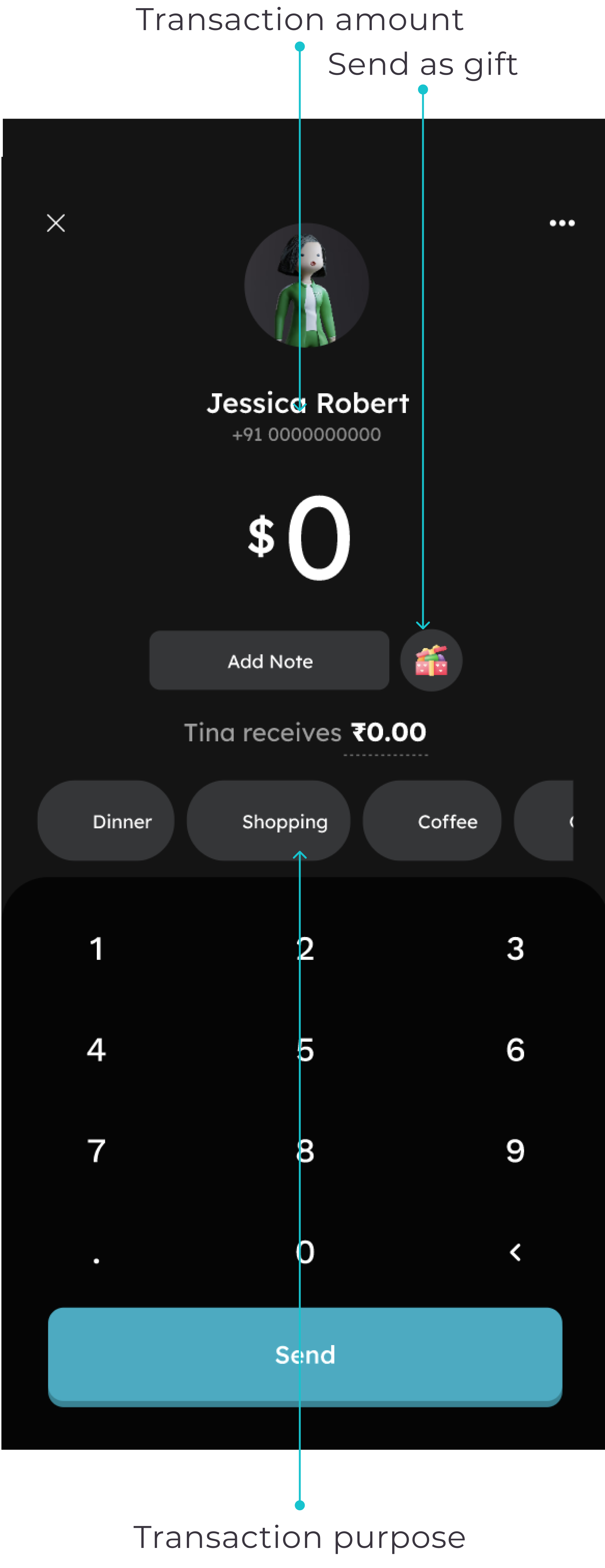
Given the significant information displayed on the third screen, our priority was ensuring user comprehension regarding the transaction fee, the amount being sent in their currency, and the amount the receiver would receive.
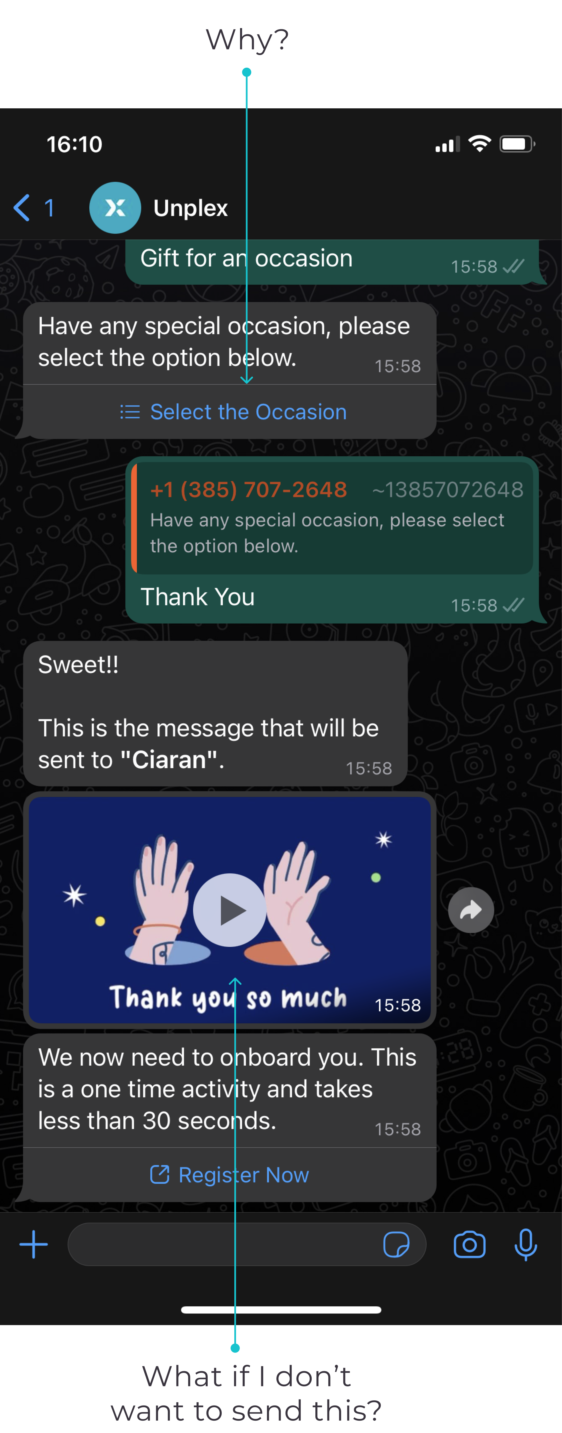
During the later phase of the process, users are prompted to specify the reason for sending money, such as the occasion or purpose. However, at this point, there is no explanation provided as to why this information is necessary. The significance of this input only becomes clear when a GIF animation, which is automatically included in the flow and doesn't allow for customisation, is presented. Given that this additional feature consumes a significant portion of the user's journey time, we aimed to validate its desirability with users.
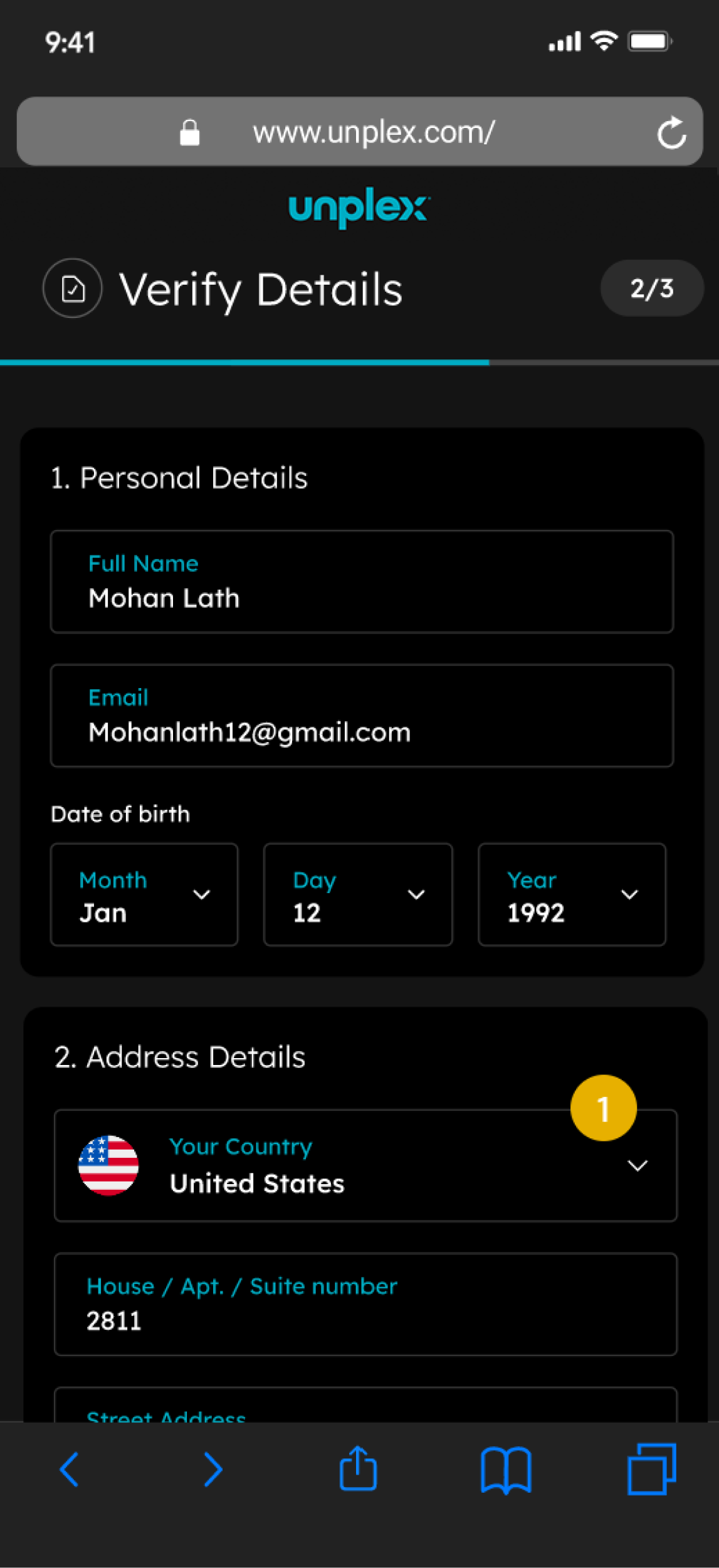
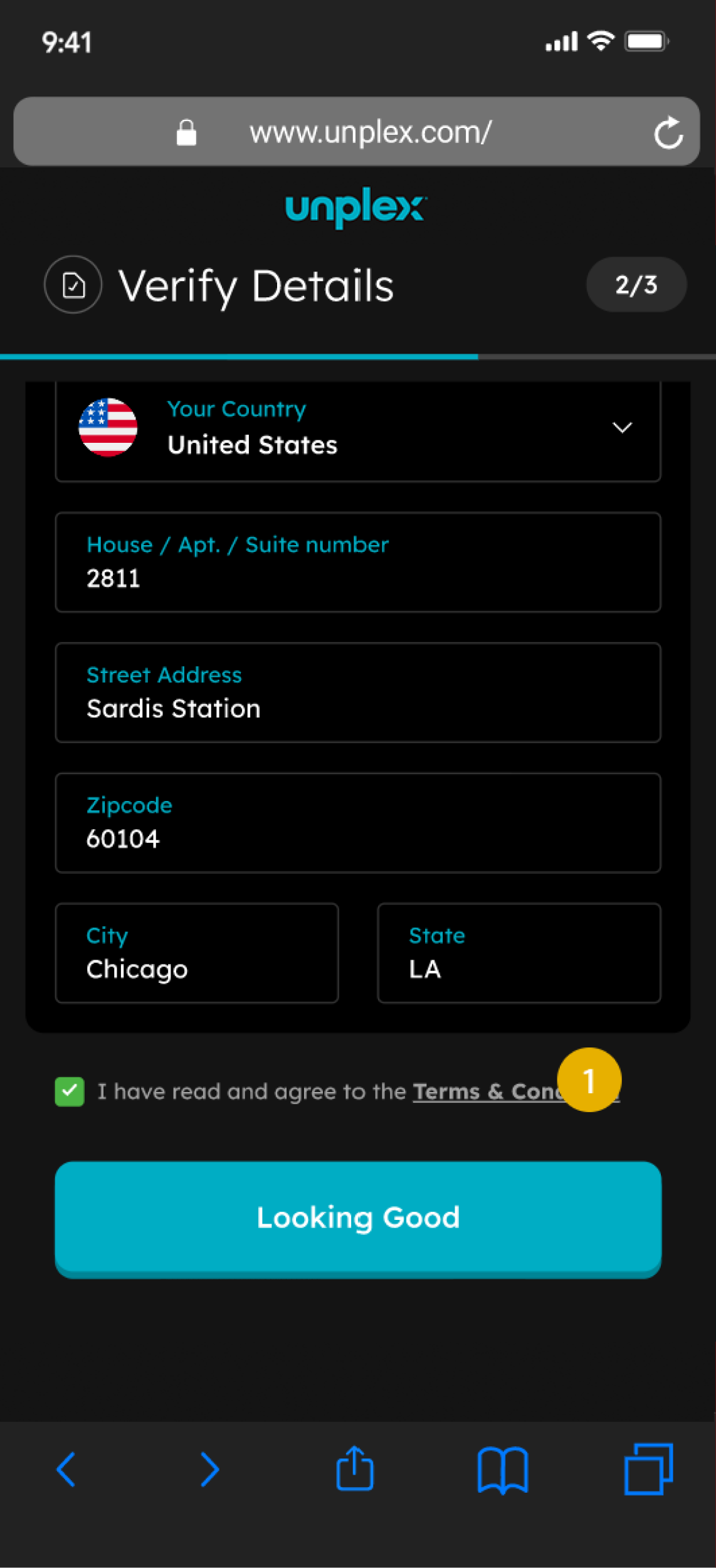
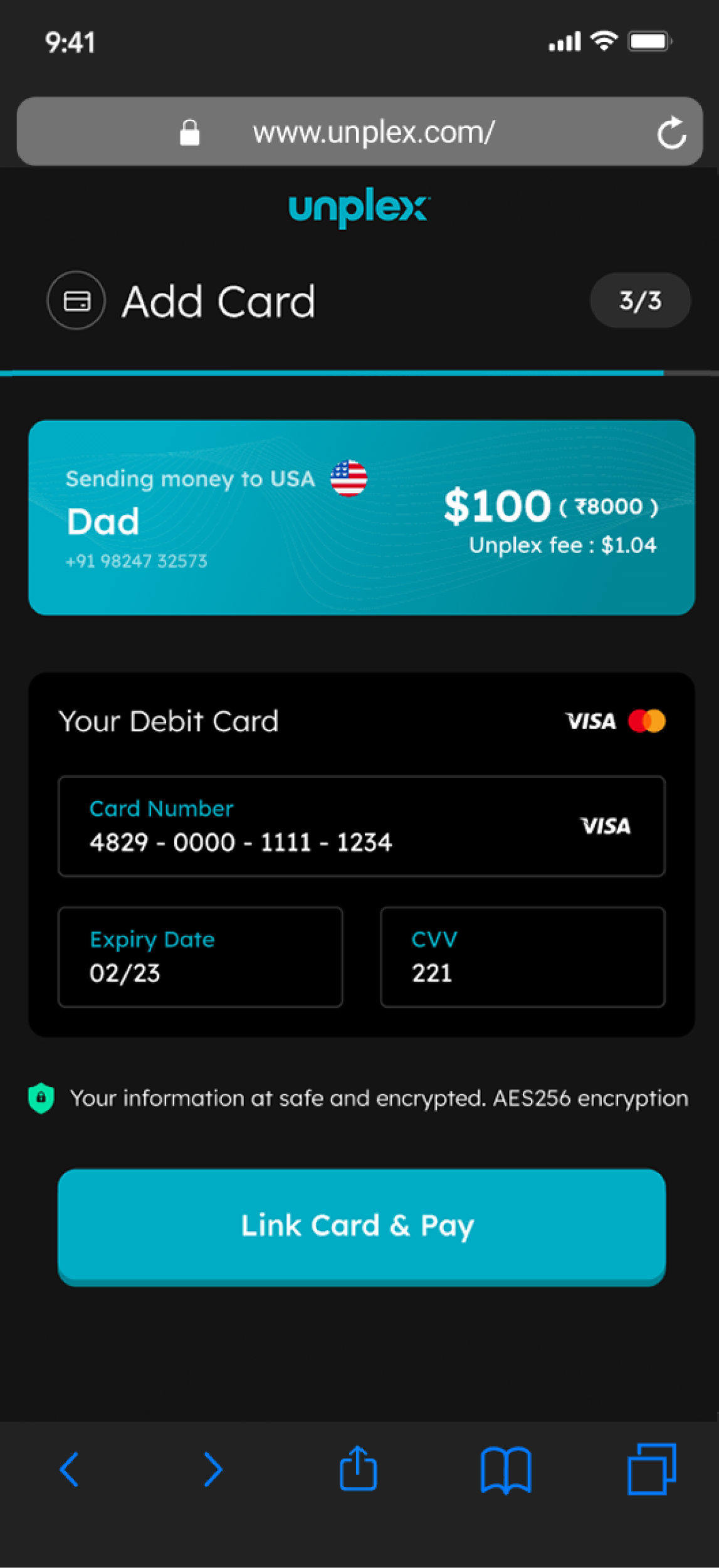
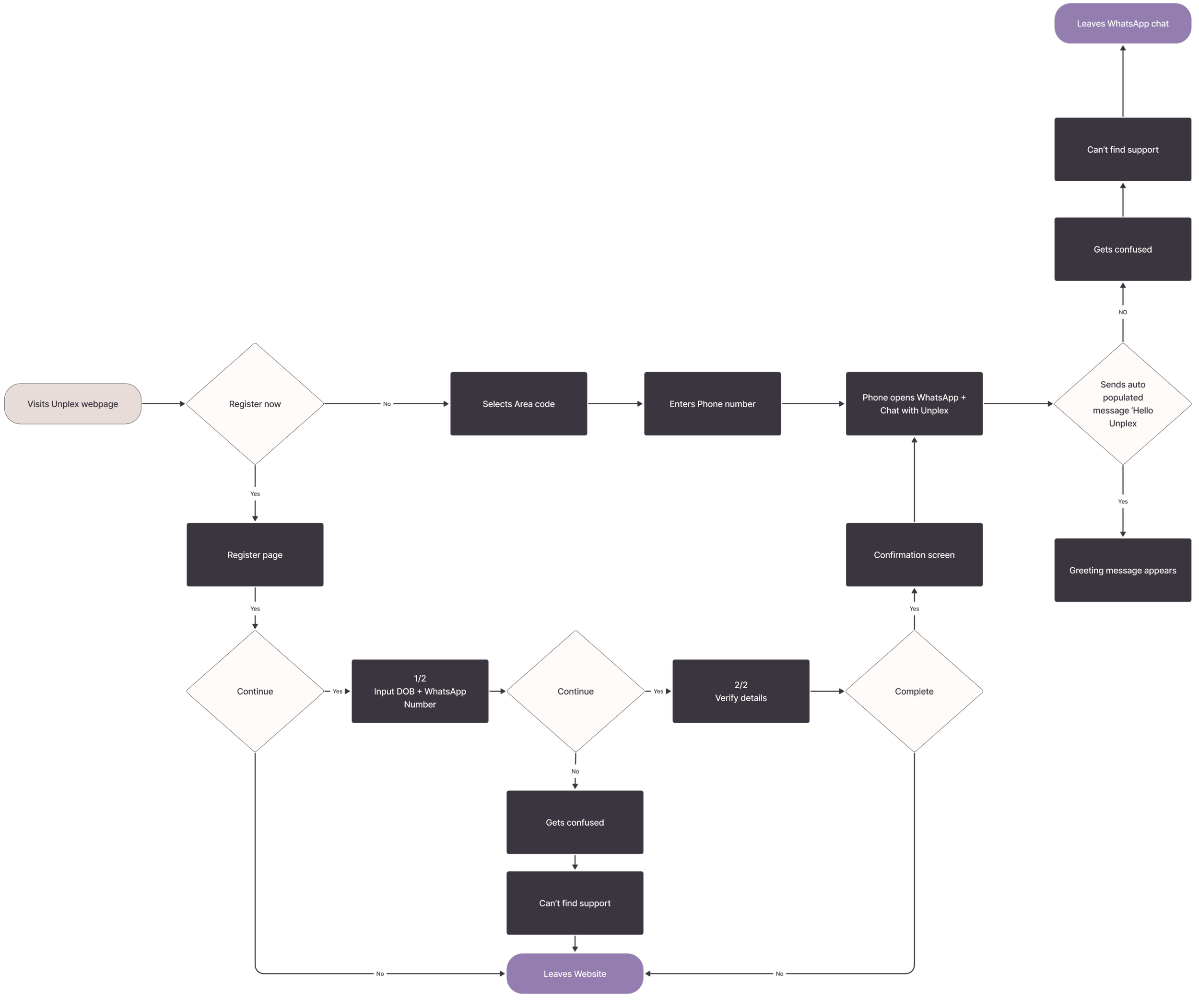
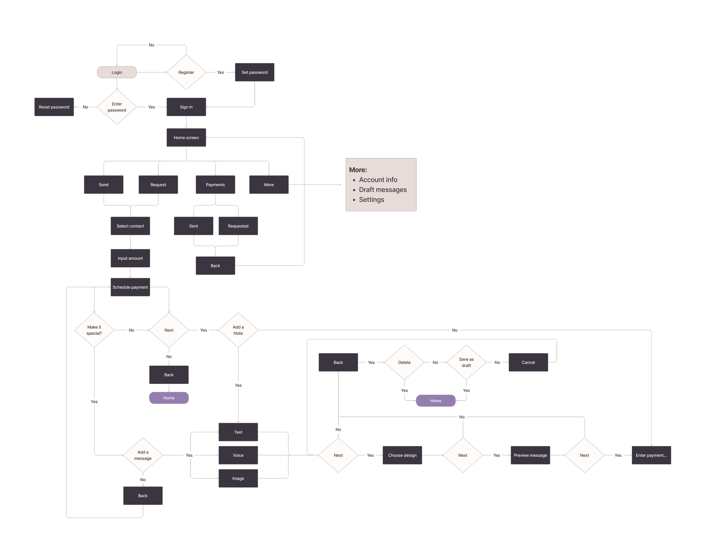
Registration flow
User are now prompted to ‘Register Now’ and taken away from WhatsApp onto Unplex’s website.
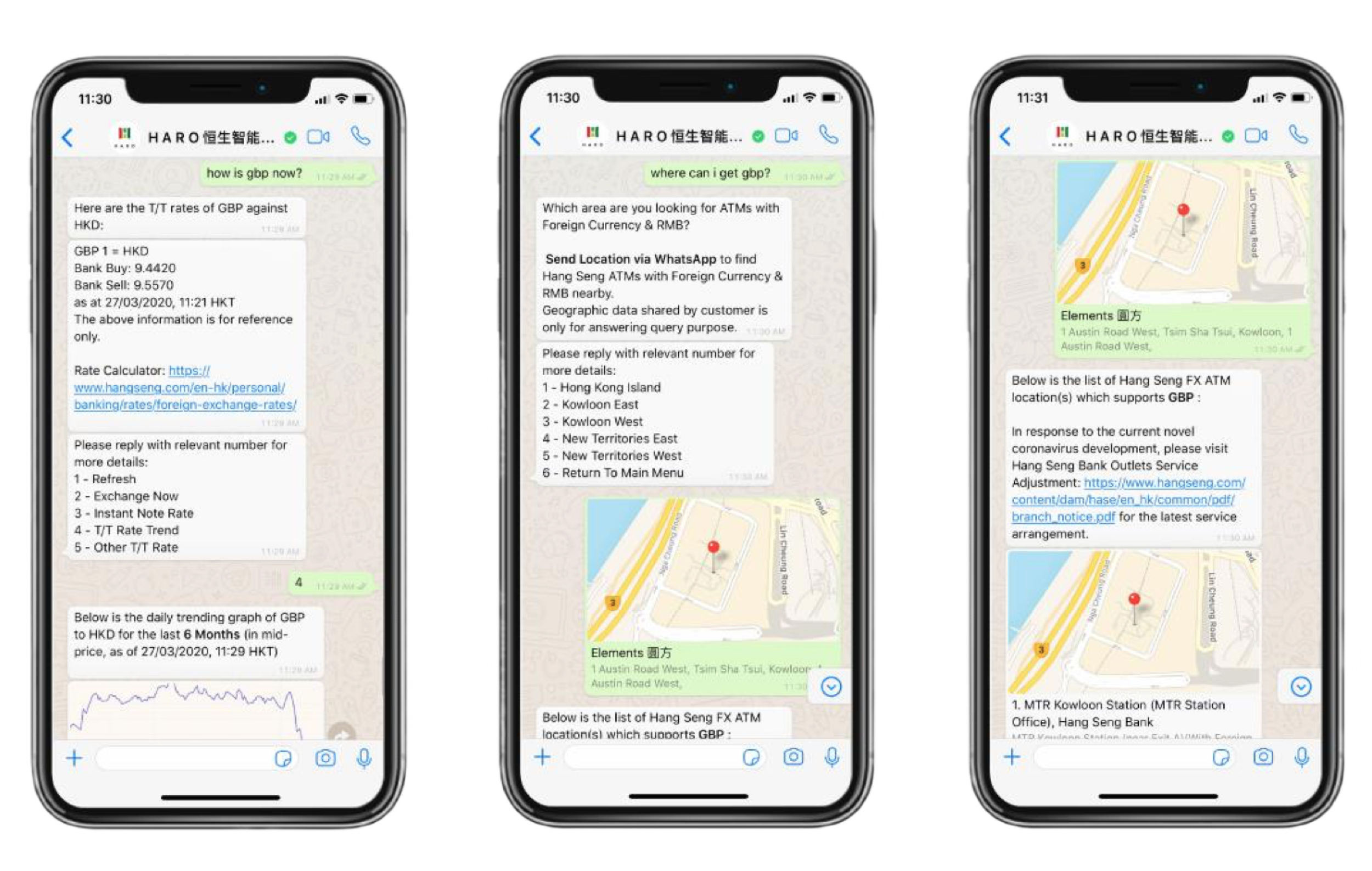
Understanding Chatbots
To enhance the user experience, we performed a competitive analysis of chatbots. This analysis helped us not only grasp the design patterns in use but also aided in crafting more natural conversations.
When using and engaging with a chatbot users want to feel supported and assisted, avoiding any feelings of confusion or frustration.
For instance, we studied Haro, a virtual assistant from a Hong Kong bank, which provided valuable insights into the power of effective UX writing in building user trust.

User testing
We developed a prototype of the WhatsApp journey and registration flow.
Assumptions included:
Users will find the improved flow easy to use
Improved UX writing will communicate better with users
Offering a Yes/No option for the GIFs feature is beneficial for users
Key Findings
The gif feature was the point in the user journey that caused the most frustration. Participants began by not fully understanding what or why they had added this to their transactions. And the more steps it included, the less appealing the feature became. Then, if they’d changed their mind, there was no option to delete.
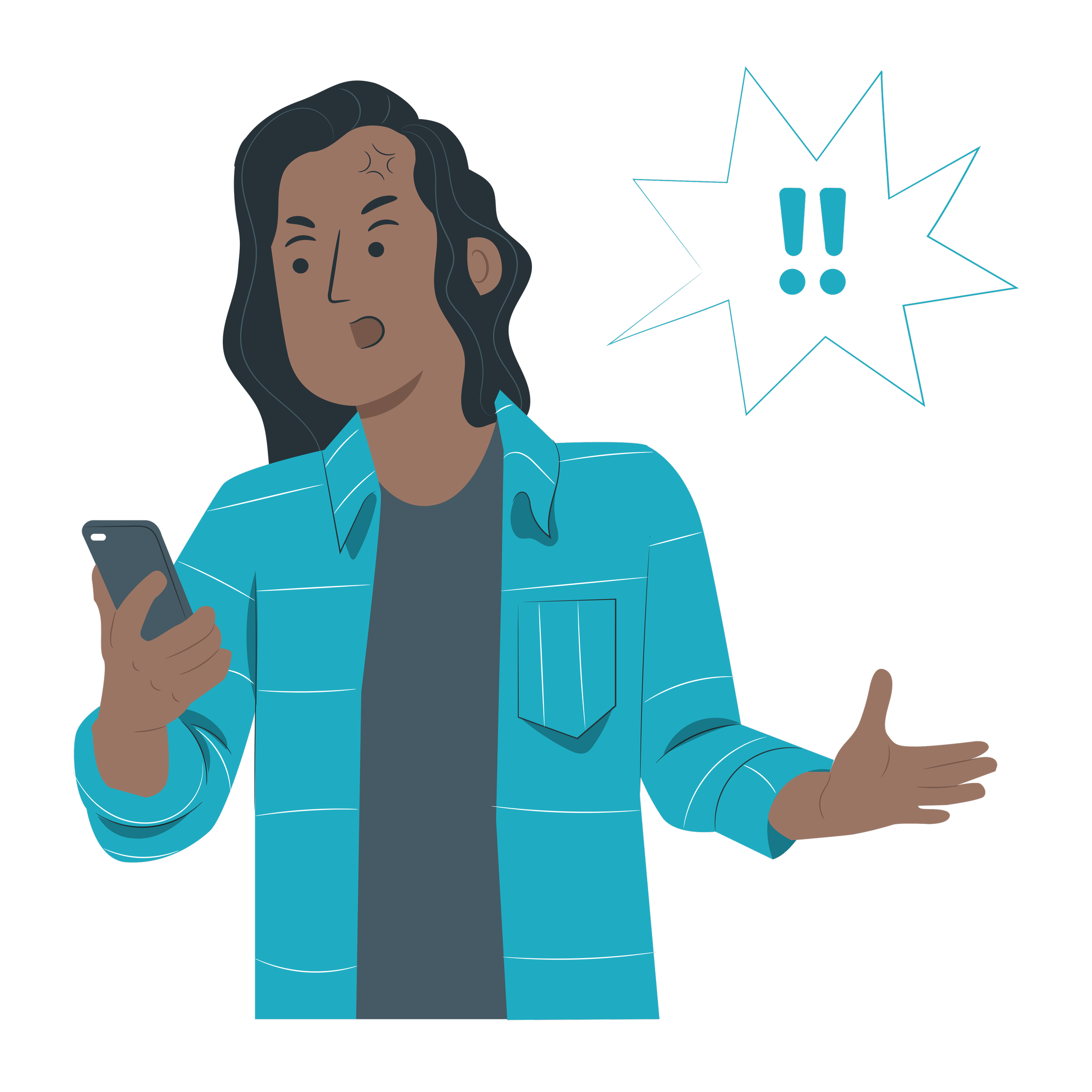
Users found registering at the end of the Whatsapp flow annoying and wanted the option to register at the beginning. They also found the current registration process (taking you out of WhatsApp to a new website) frustrating, confusing and thought they were being scammed.

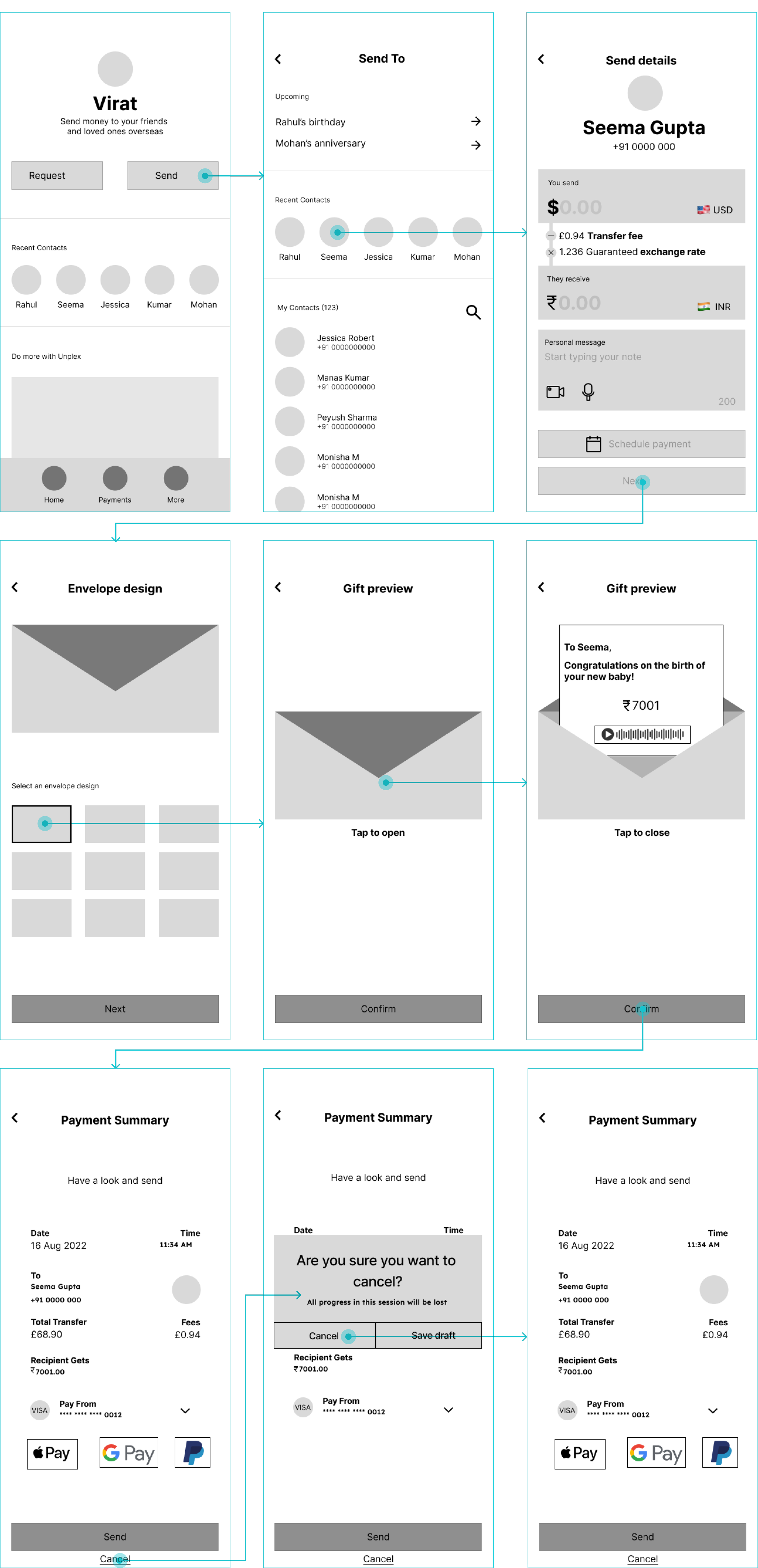
Solution
So, how can we reduce these frustrations?
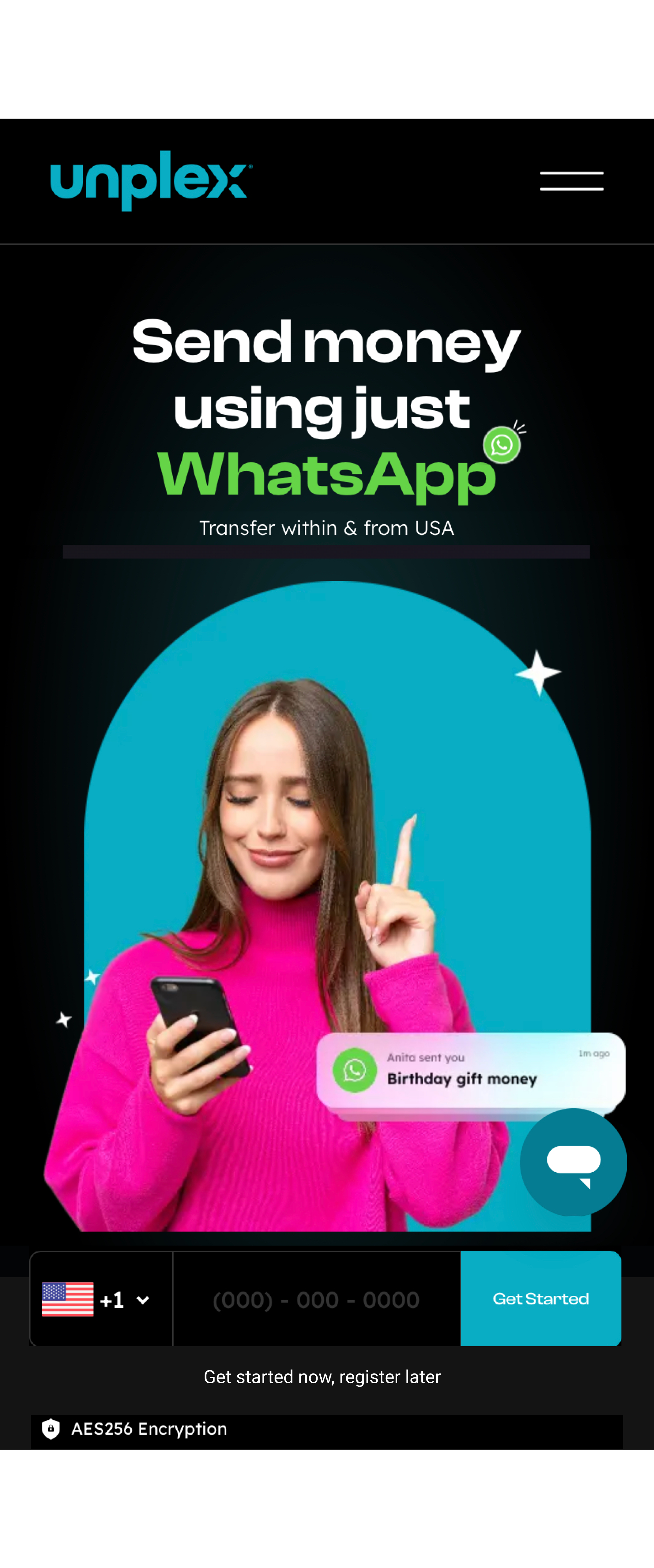
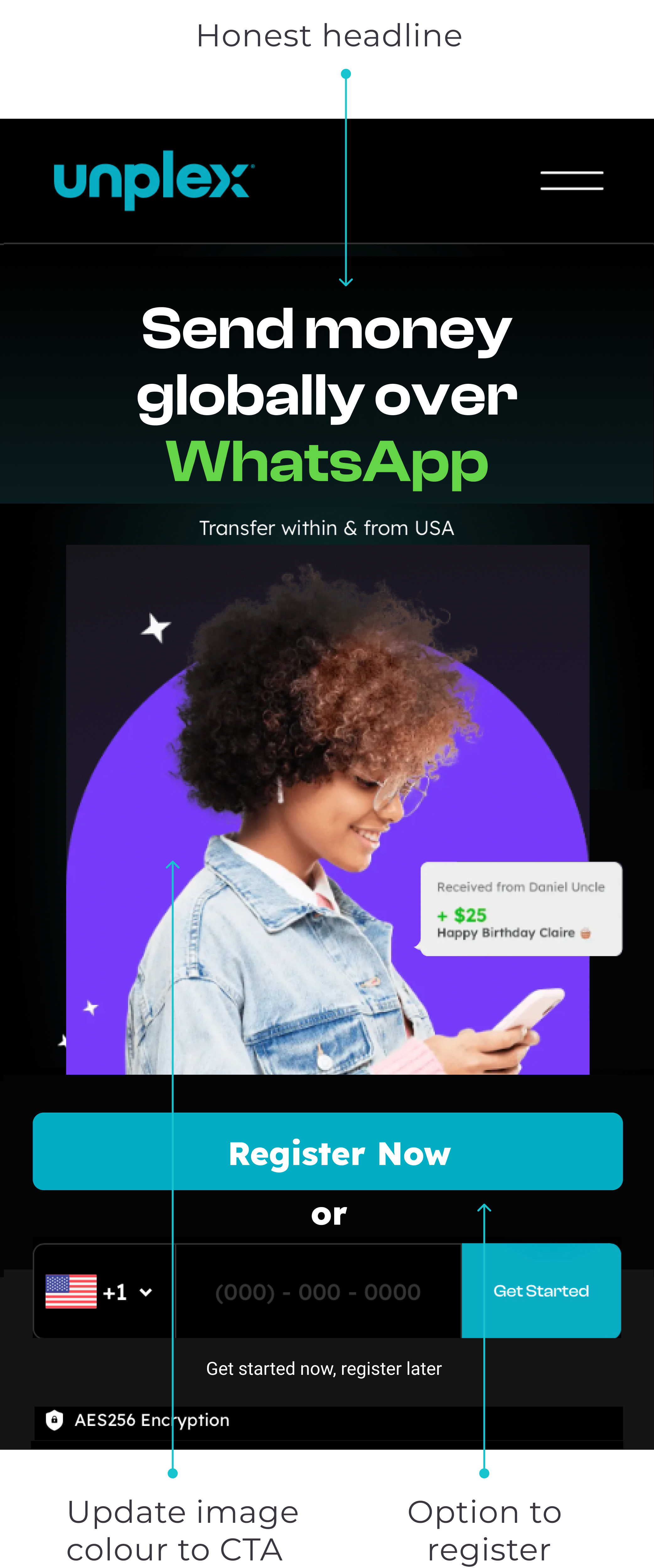
Website Homepage
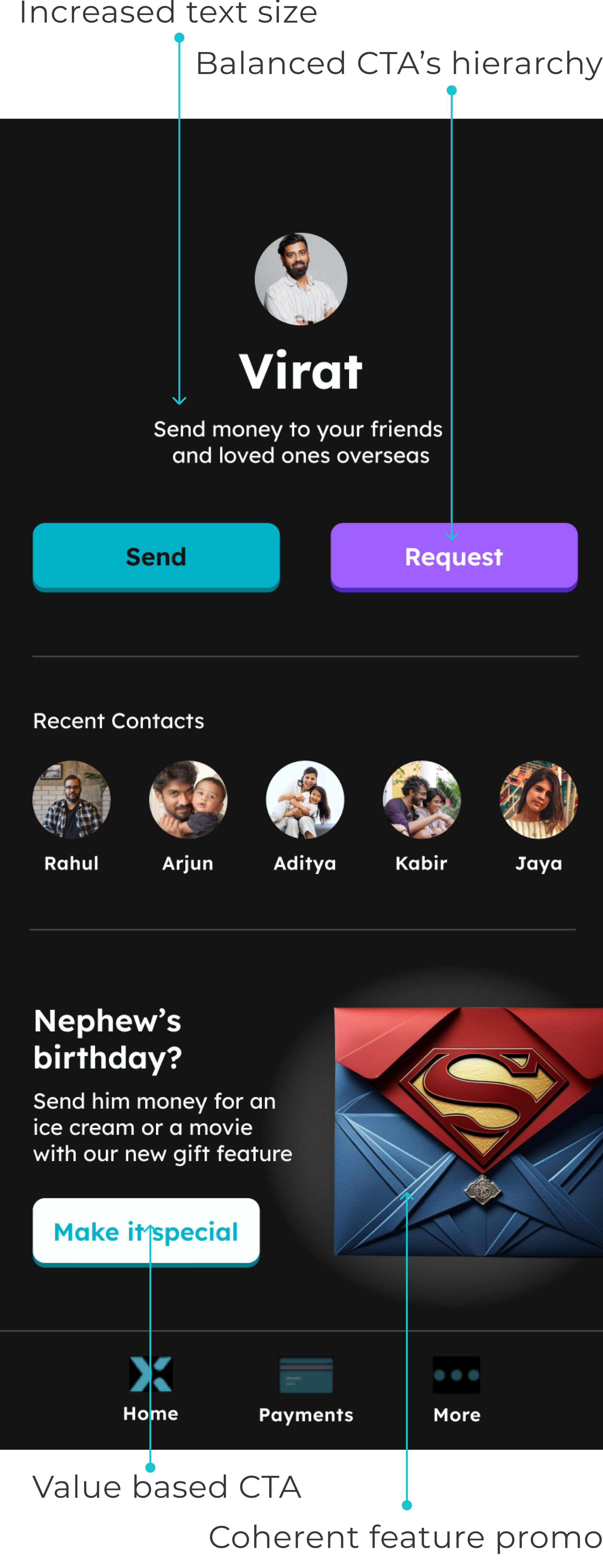
Placing the "Register Now" call-to-action (CTA) at the beginning so users can decide whether to register before moving into WhatsApp. We also suggested they swap the hero campaign image colour to make the CTA more prominent.
Original
Recommendation

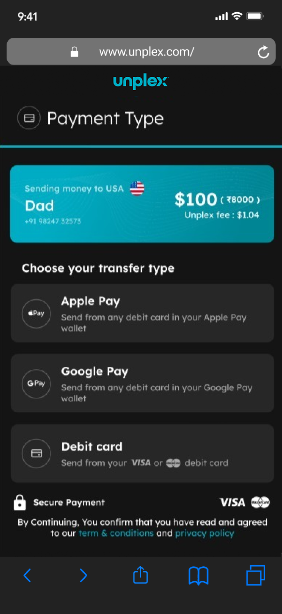
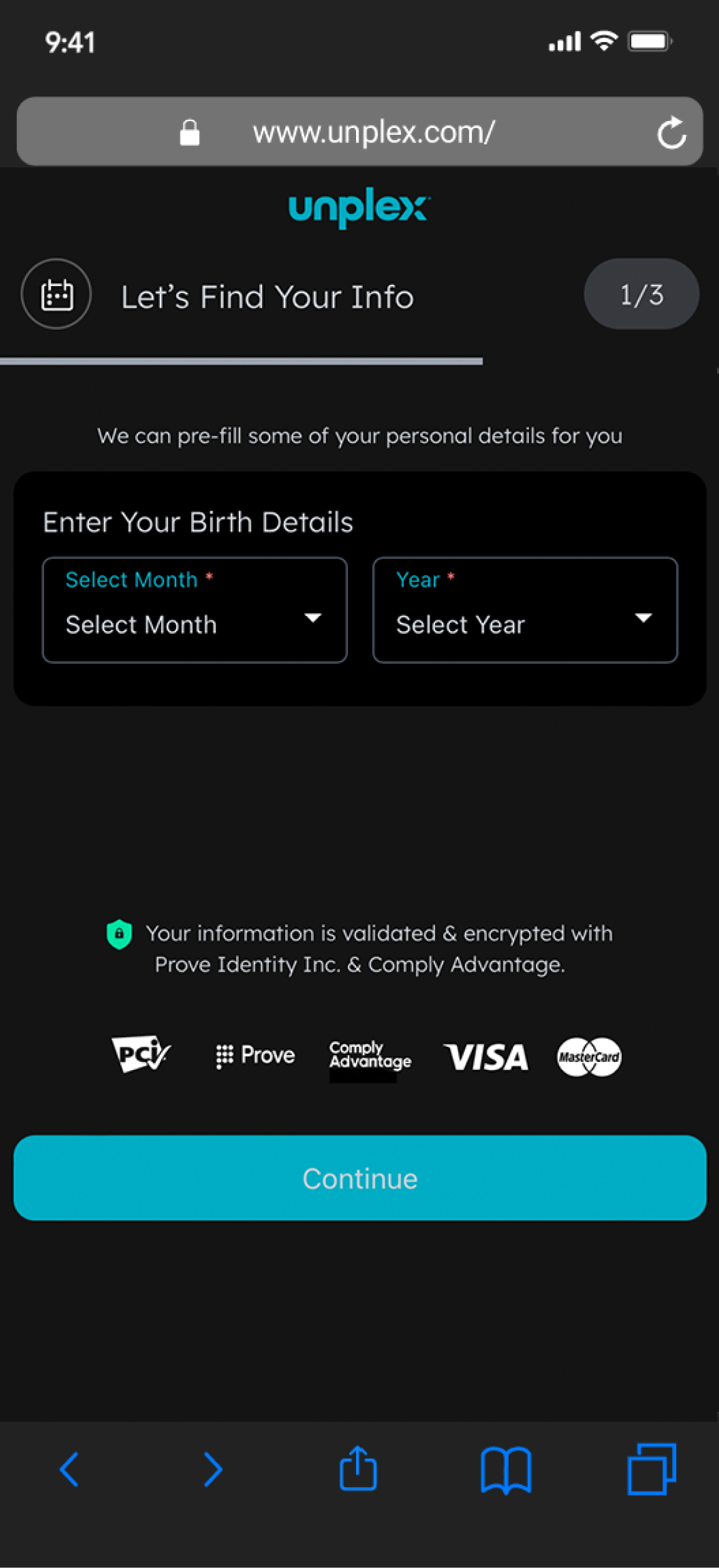
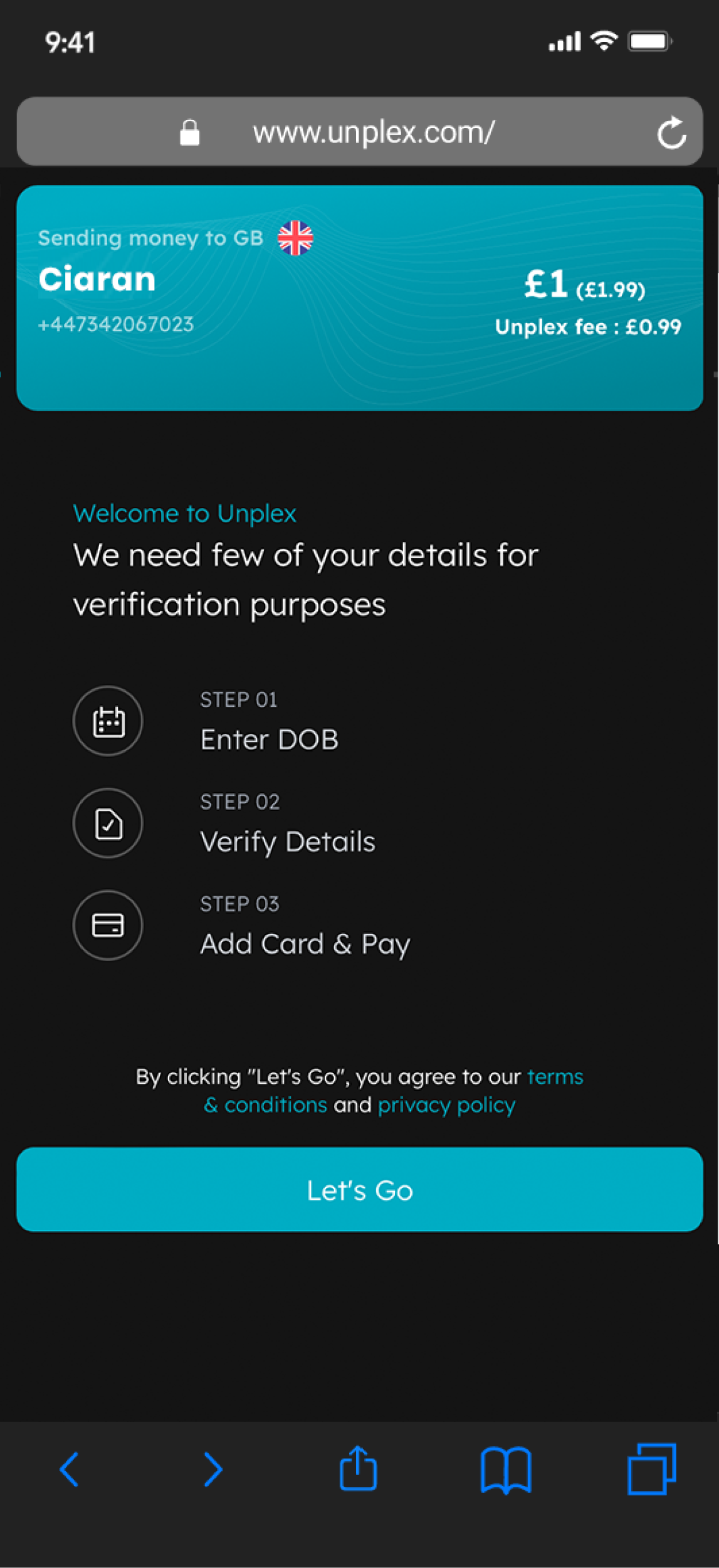
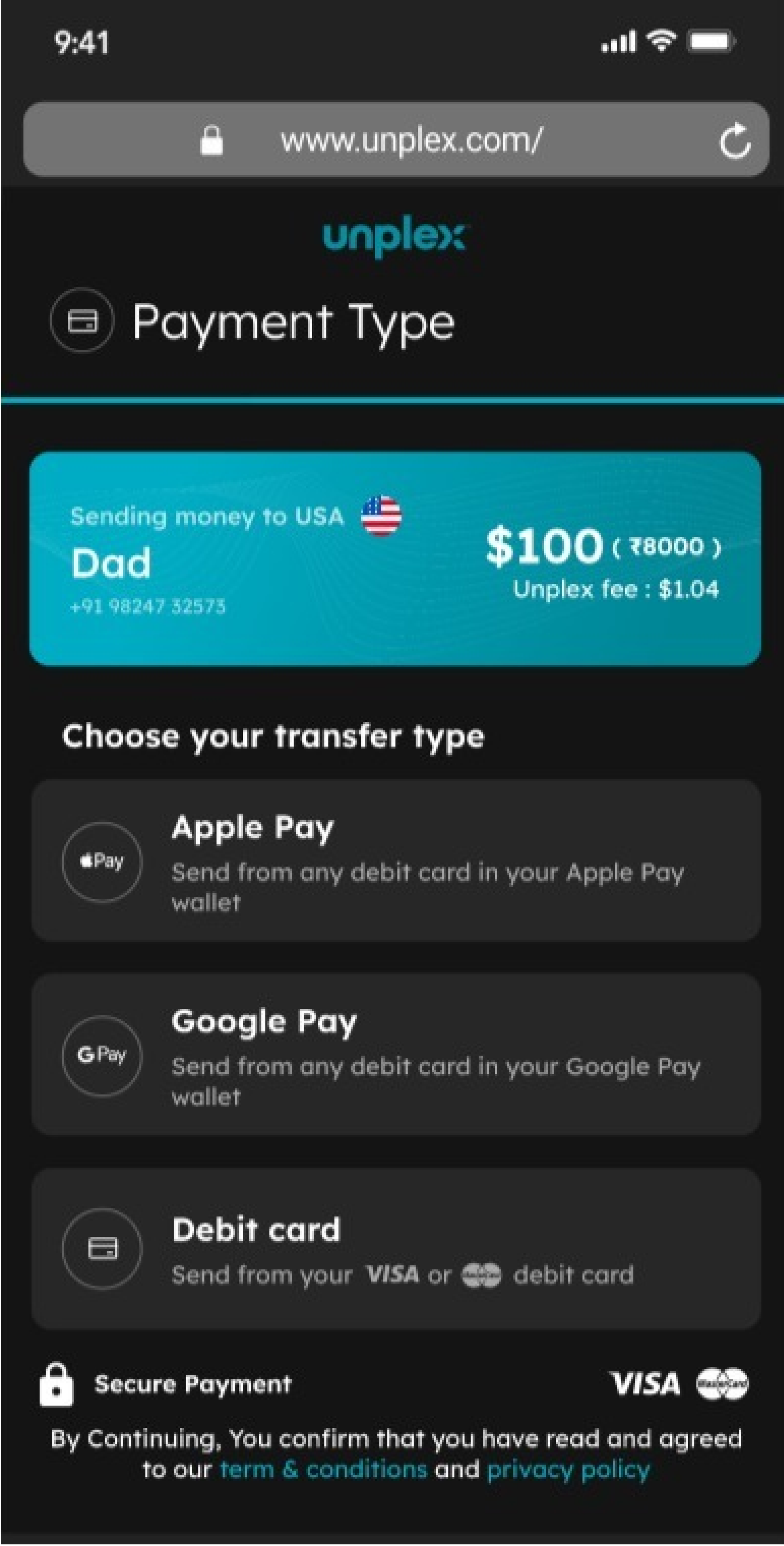
Payment registration flow
Original
Recommendation
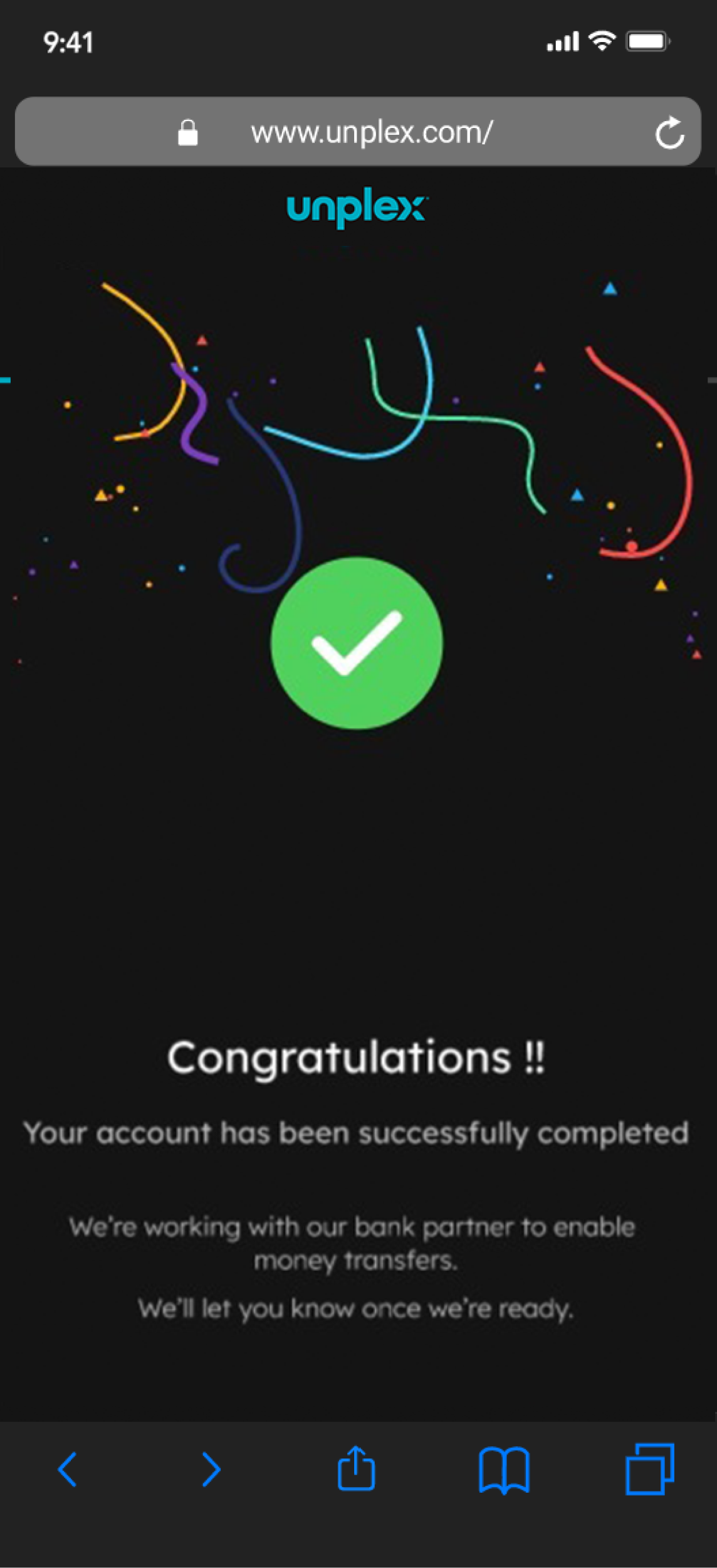
The result
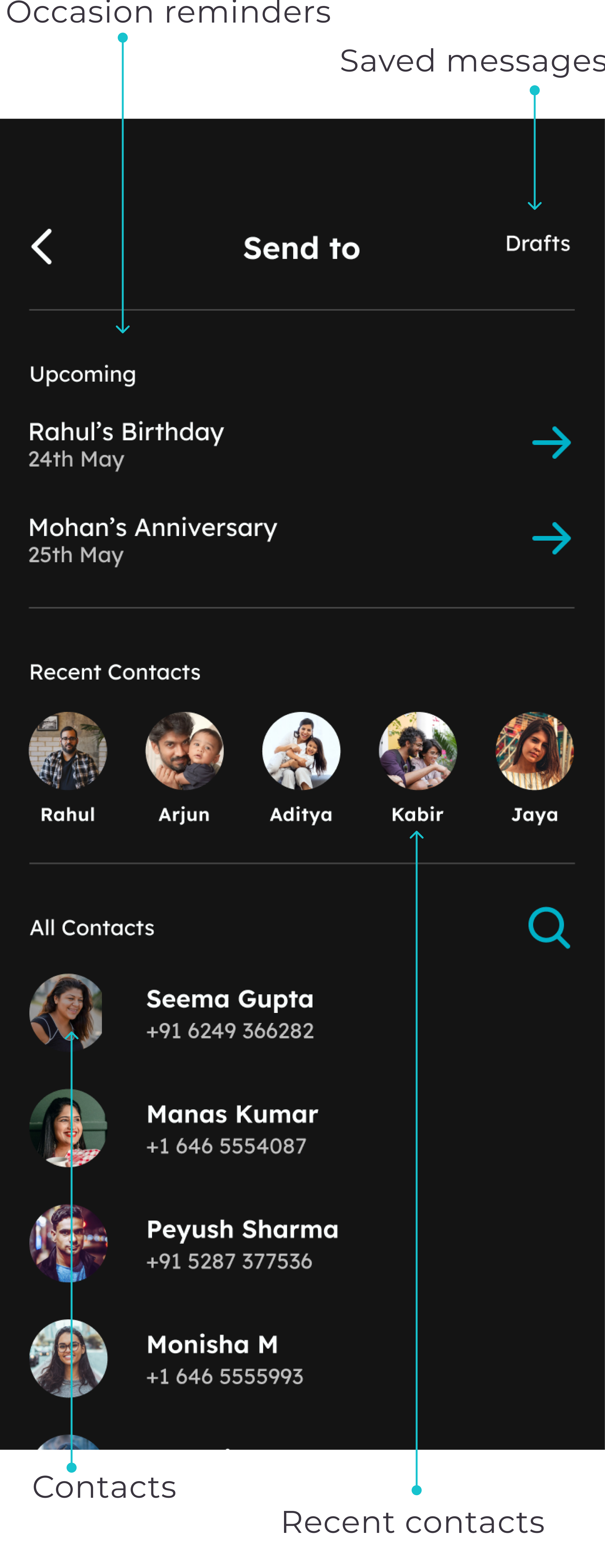
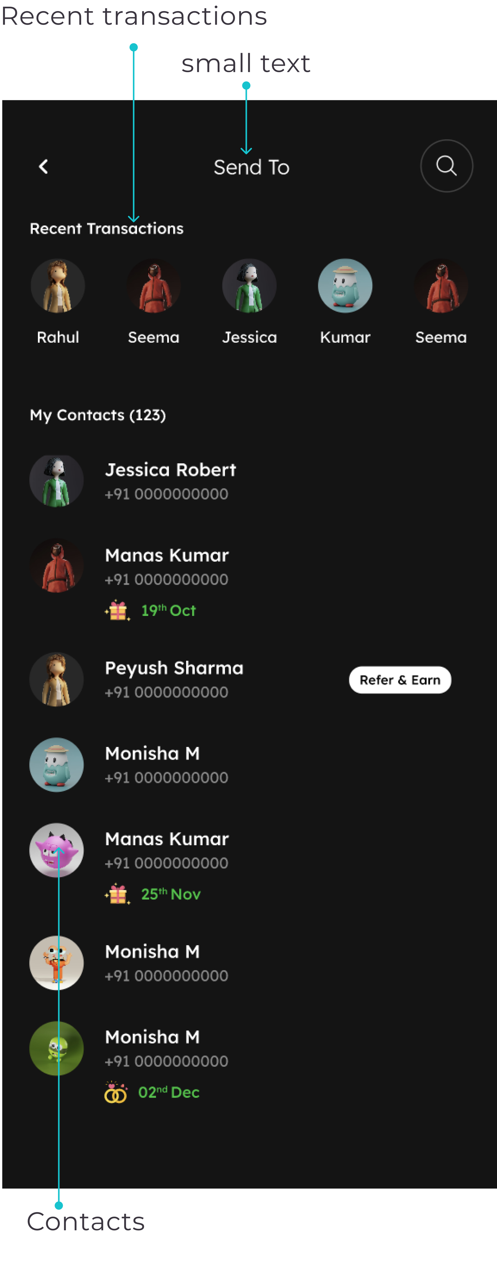
After conducting usability tests and gathering valuable user feedback, we made significant improvements to the user experience. We consolidated pages, restructured the flow, and enhanced the clarity of the UX writing. As a result, users won't encounter unexpected screens when they believe they've completed a task.
Now, all calls to action (CTAs) are consistently placed, and the UX writing provides clear guidance on the user's progress. In summary, we managed to decrease the number of clicks required throughout the entire WhatsApp and registration flow by one-third.

The native app design
The native app offers a similar process and functionality as the WhatsApp flow but provides greater flexibility and the ability to incorporate customised features.
Upon reviewing the screens provided by the client, we embarked on the complete double diamond design process, commencing with a thorough competitive analysis.
Competitive analysis
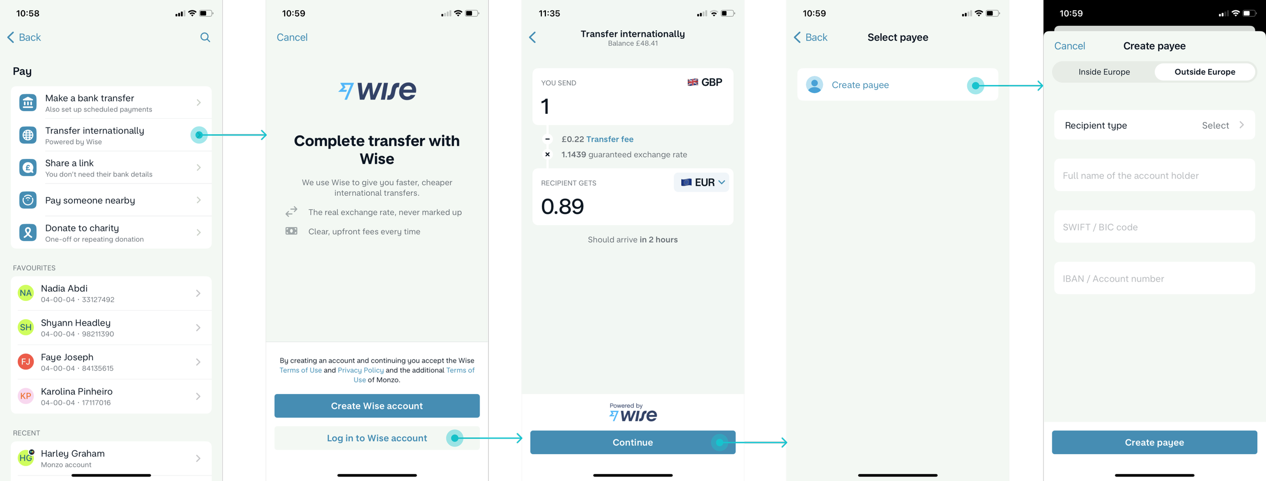
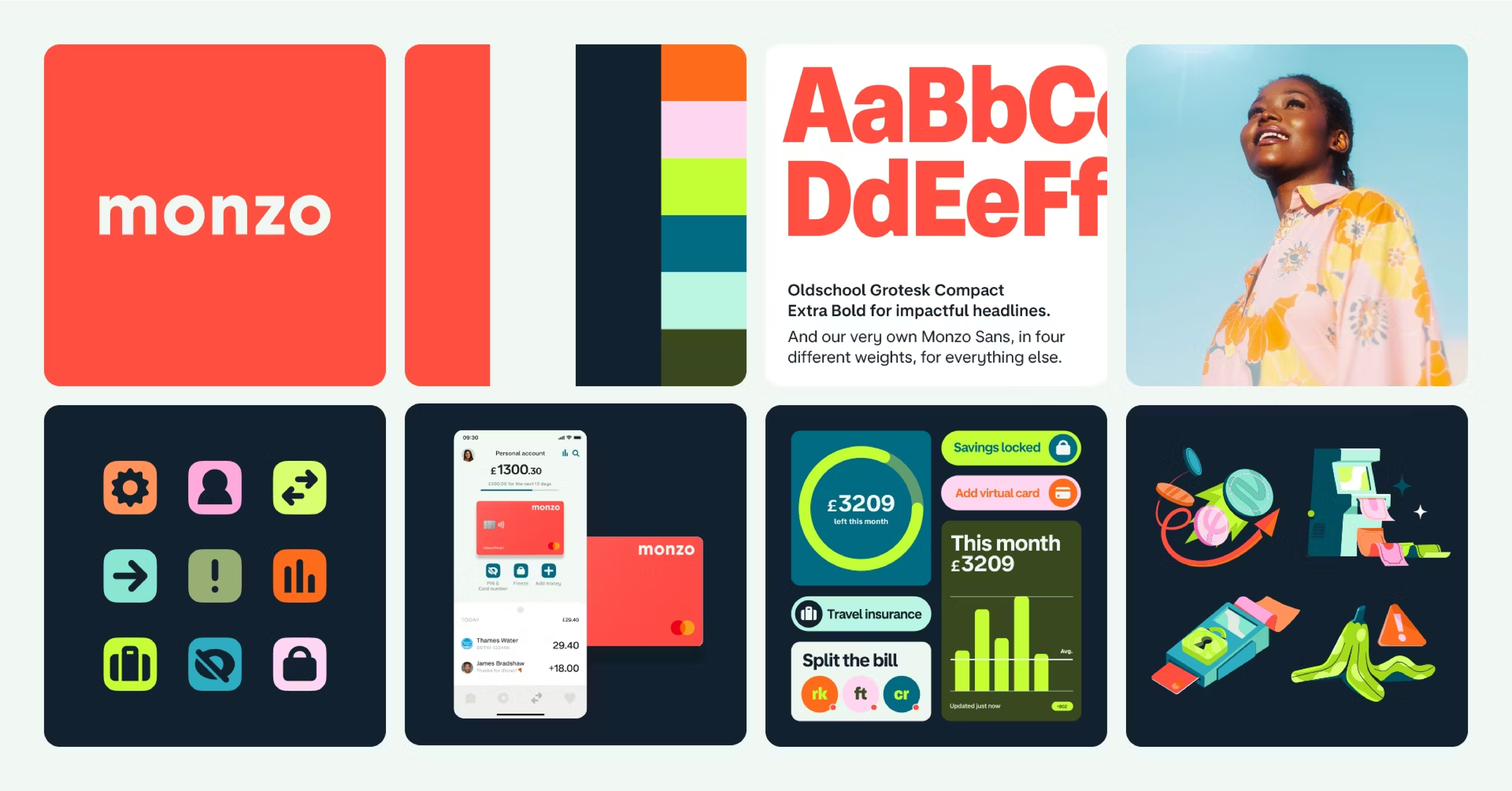
During our research, we examined various fintech apps, including Wise, Revolut, and Monzo. One captivating statistic we discovered was that Ipsos reported 81% of users would recommend Monzo's mobile banking service. Monzo's incorporation of social and financial features particularly resonated with our objectives, making it highly relevant to our project.
Feature analysis for Monzo – a fintech
competitor with social and financial features:
Send money internationally via Wise Partnership
Send and request money via a link
Request money via a QR code
Split the bill
Pay someone via a phone number
Managing personal finances
Comparative analysis
During our initial meeting with the client, we recognized that community played a significant role in setting Unplex apart.
Given that our clients belong to the Indian community, they highly value the cultural tradition of cash gifting and expressed a desire to incorporate it into the product.
This discussion prompted our teammate Layla to consider the cash gifting culture in her home country in Asia. As a result, she suggested exploring the following examples:
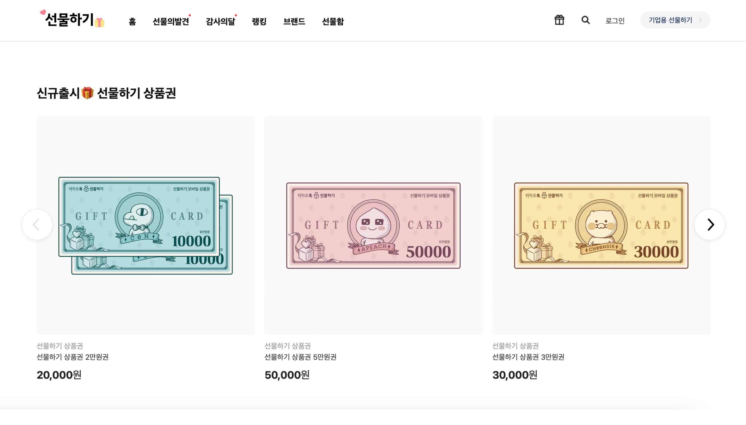
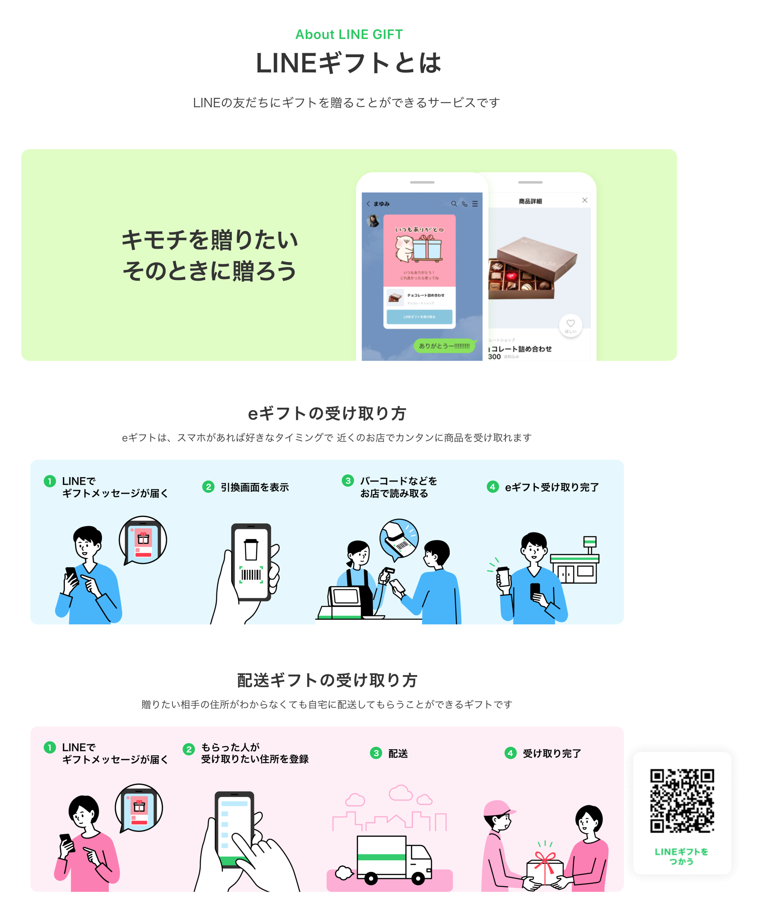
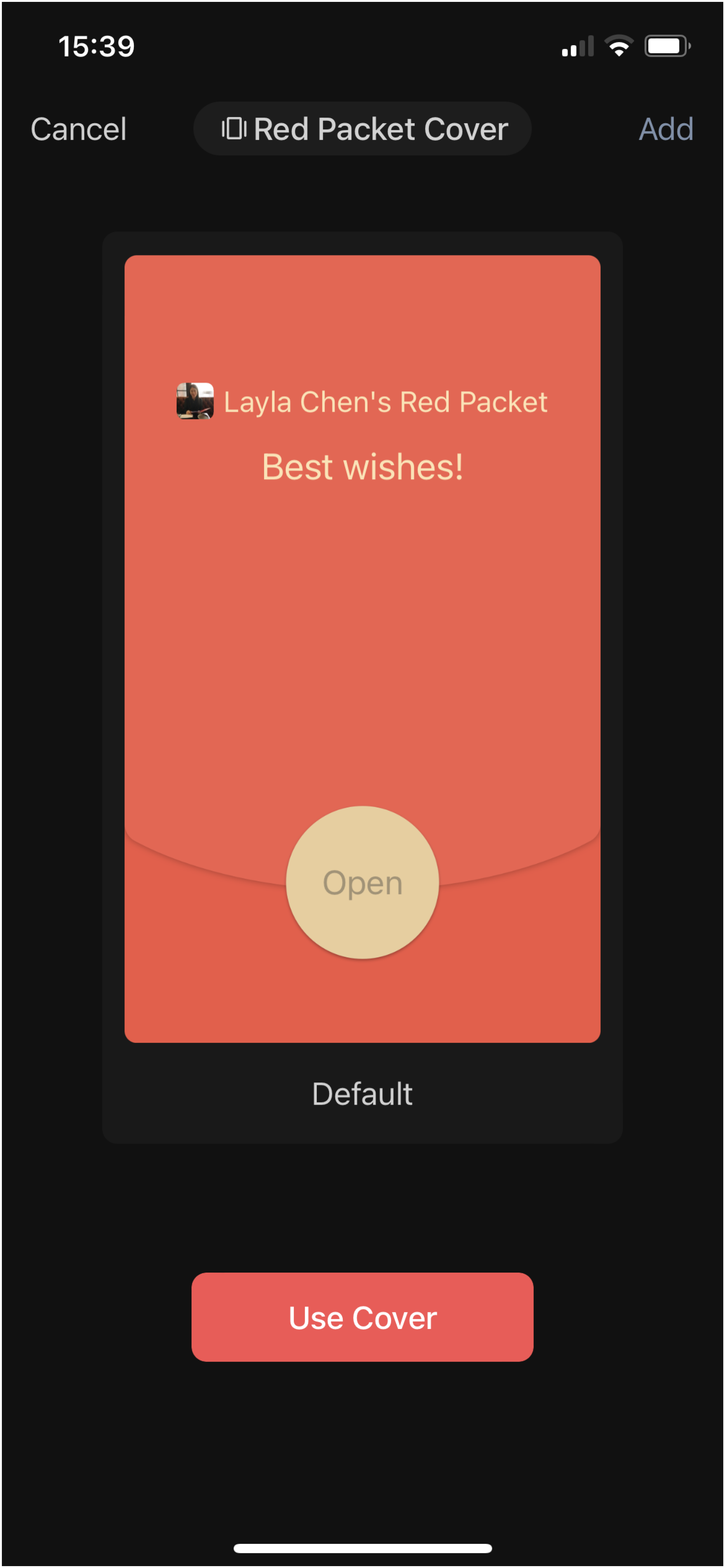
WeChat red pocket – This application enables users to send virtual "credits" as monetary gifts to other users within the app. The money is then deposited into the recipient's WeChat Pay account, which can be utilised for purchases. The app also allows for easy withdrawals from the account.

User interviews
Research goals
To start our research plan, we compiled a list of our goals for what we wanted to gain further insight on.
The key areas to focus on:
Understanding users thoughts and emotions surrounding their community
Learn more about users communication preferences
Understanding users behaviours and feelings about gifting cash online
How do users manage their personal finances between countries
Learn more about how users financially support friends and family abroad
As an outsider looking into this topic, we naturally had a few assumptions:
People with family abroad partake in cash gifting
Most 1st Generation Indian immigrants support family back home
Fintech Apps are widely used across the world
WhatsApp is commonly used to stay in touch
Android phones are more prevalent in India
With these ready to validate or invalidate, we were excited to learn more about this topic.
Key findings
We conducted interviews with a total of 14 users, a combination of those were provided by the clients and others we sourced. Notably, all of the users had backgrounds in communities residing abroad.

In person matters
Participants preferred engaging in cash gifting activities, specifically in person. They believed that a simple digital transfer couldn't replicate the significance of personal interaction.
Special occasions
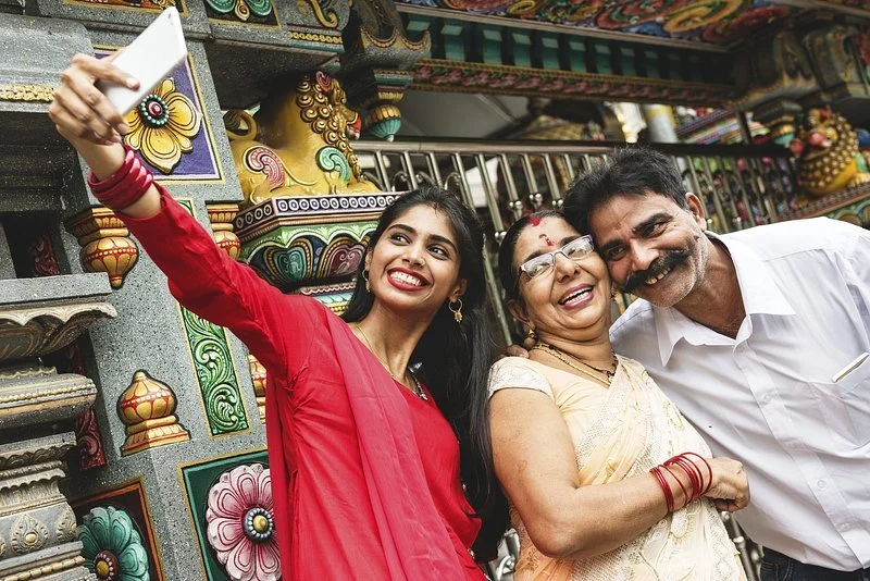
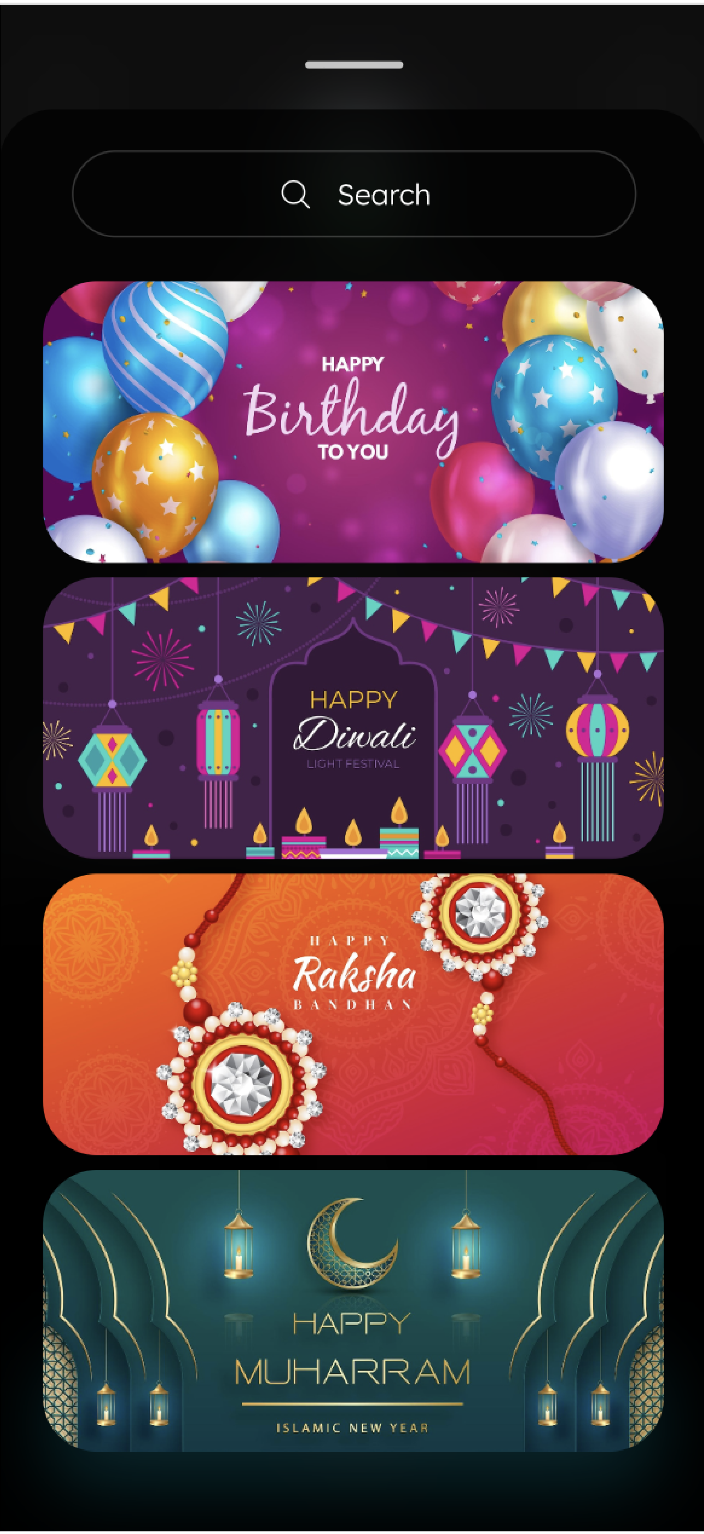
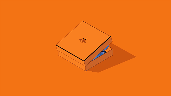
Cash gifting in India involves various traditions, such as presenting cash in special envelopes with different colours based on the occasion.

Gift cards
Participants shared their dissatisfaction with simply transferring money to friends or relatives, as it lacked the same meaning. Consequently, people sought alternative methods for gifting money, such as Amazon gift cards or even opting not to give cash at all.
Define
Persona
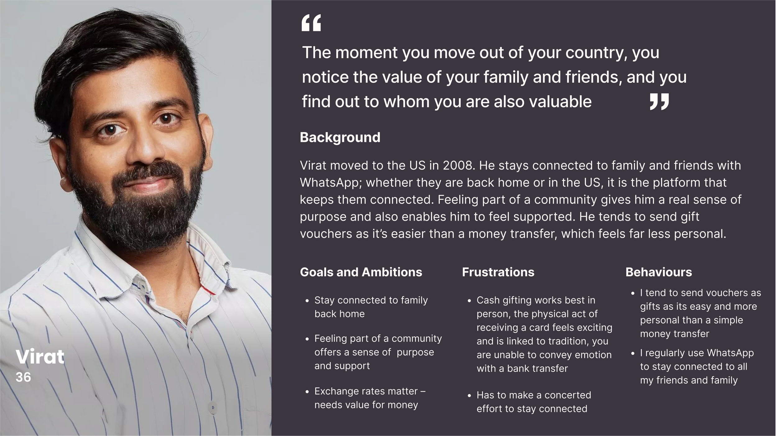
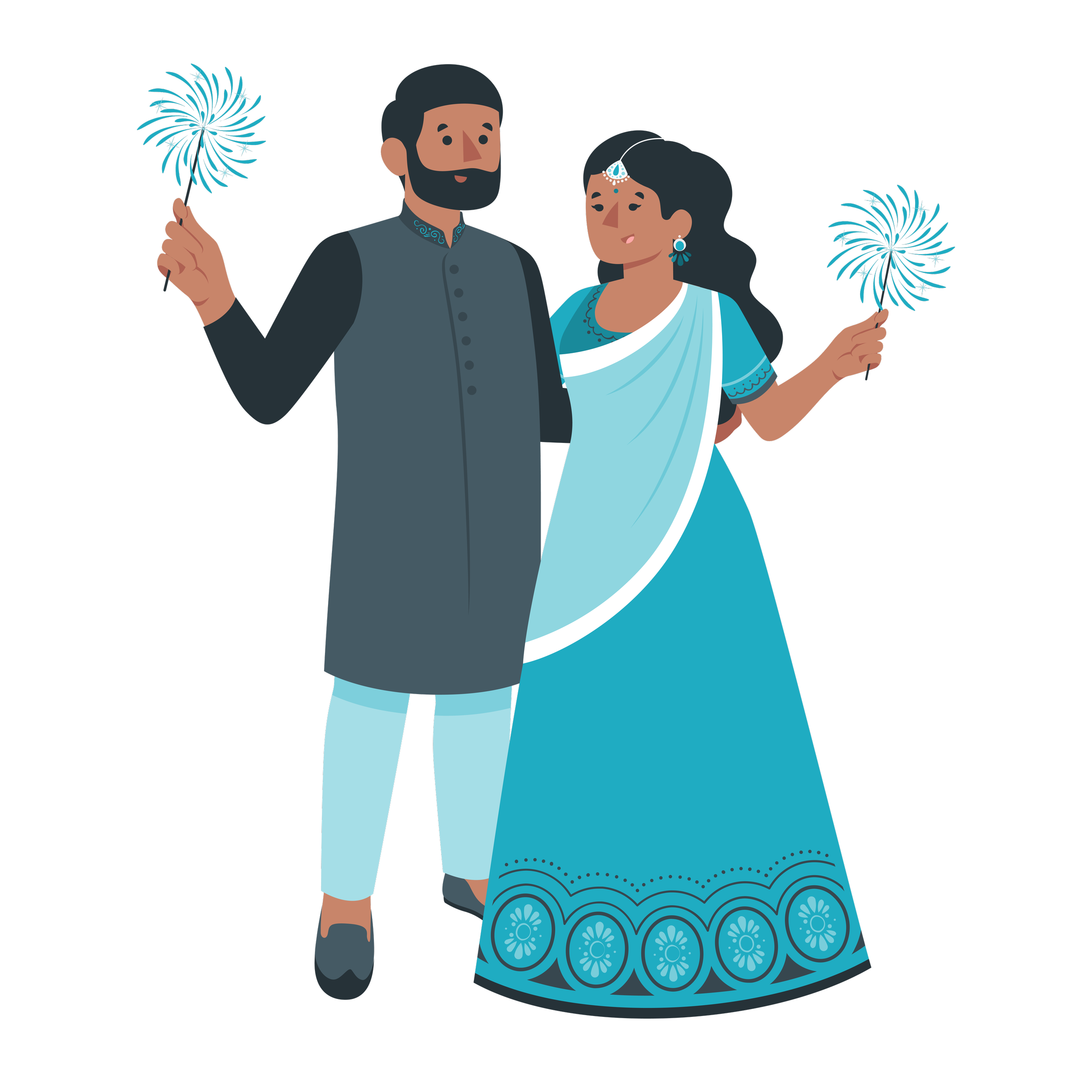
Virat has stopped partaking in the tradition of cash gifting, as he cannot make the experience feel personable and capture the cultural significance.
Problem statement
How might we create a cash gifting solution that leverages the excitement and tradition of physical experience?
How might we

Ideation
Design studio
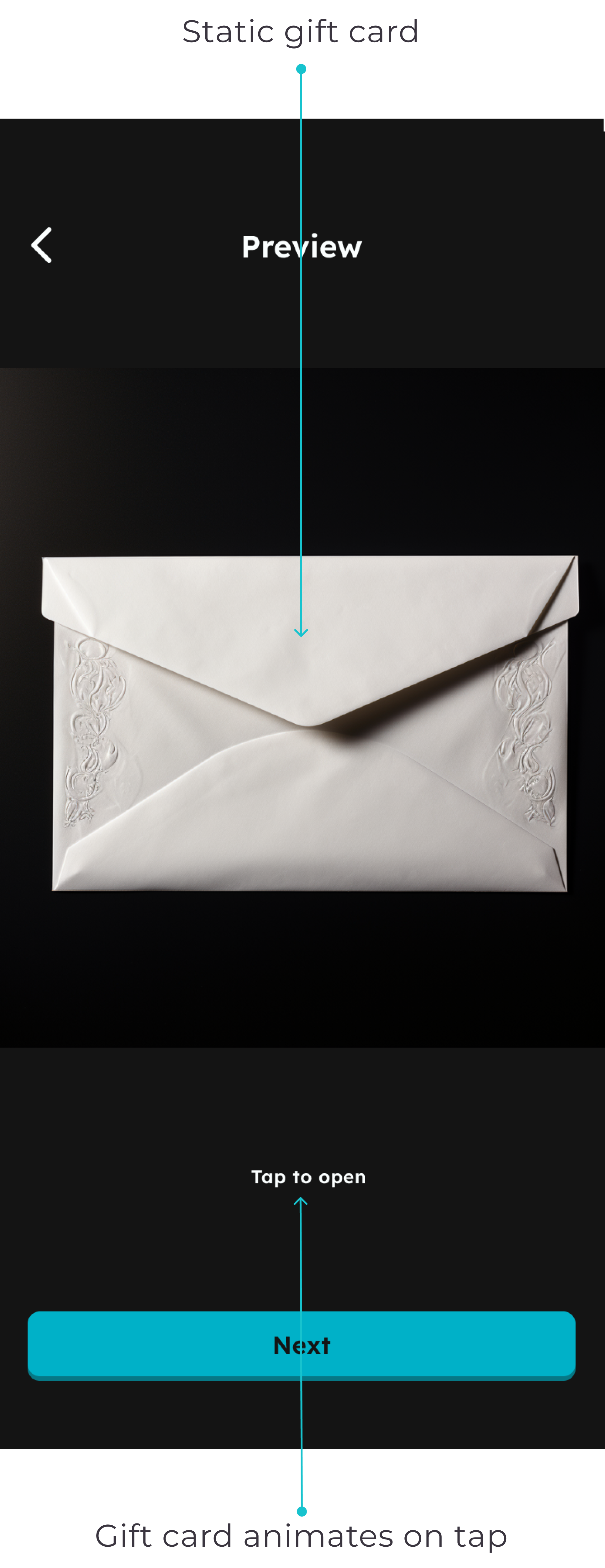
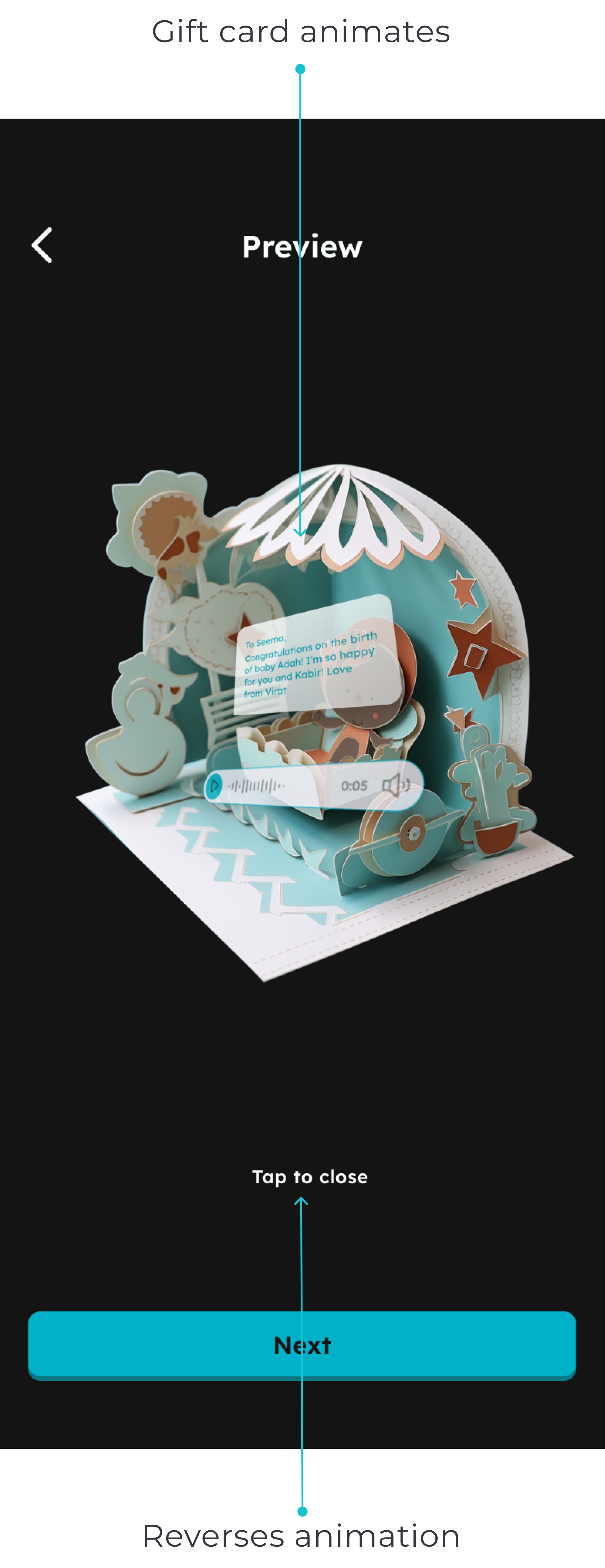
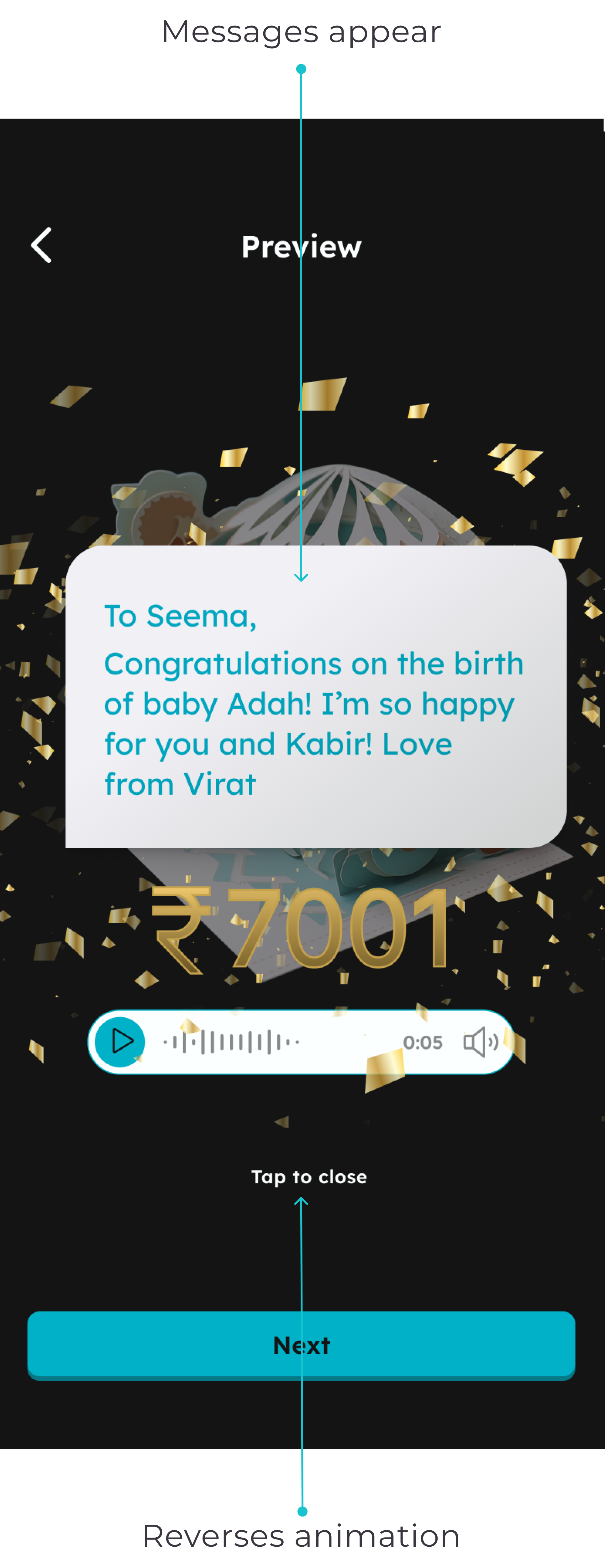
The design studio was a great opportunity to put our problem statement and HMW question into practice. Very similar designs arose, so voting was the most democratic process to pick the ideas to take forward. The key winner was having a card that the receiver taps to open. This idea was closely followed by also being able to send a video and/or voice message. We focused our effort on the envelope idea, keen not to get ‘featuritis’ and if time and scope allowed, only then would we consider including these additional features.
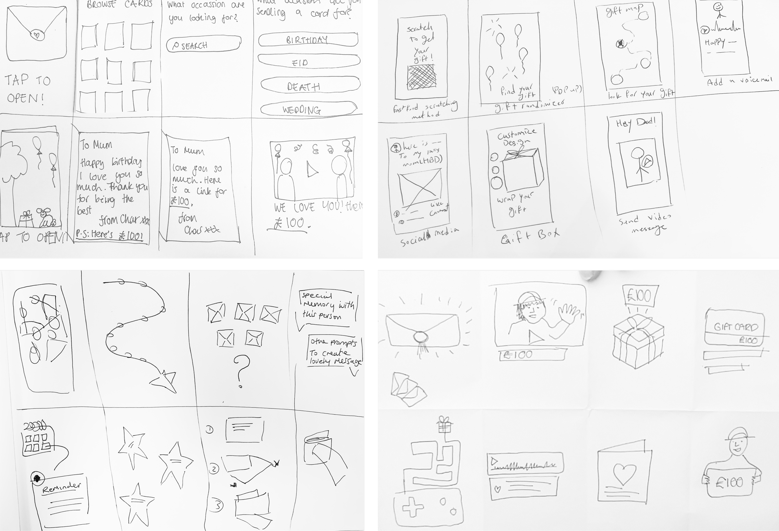
Low-fi sketches
The team had agreed to develop the envelope feature, but the hard part now was aligning everyone's version. We all had good ideas and a different picture of implementing it into the app.
To overcome this, we time-boxed ourselves to 20 mins and individually sketched a low-fi flow. We combined these sketches to utilise the best ideas for our first wireframes.
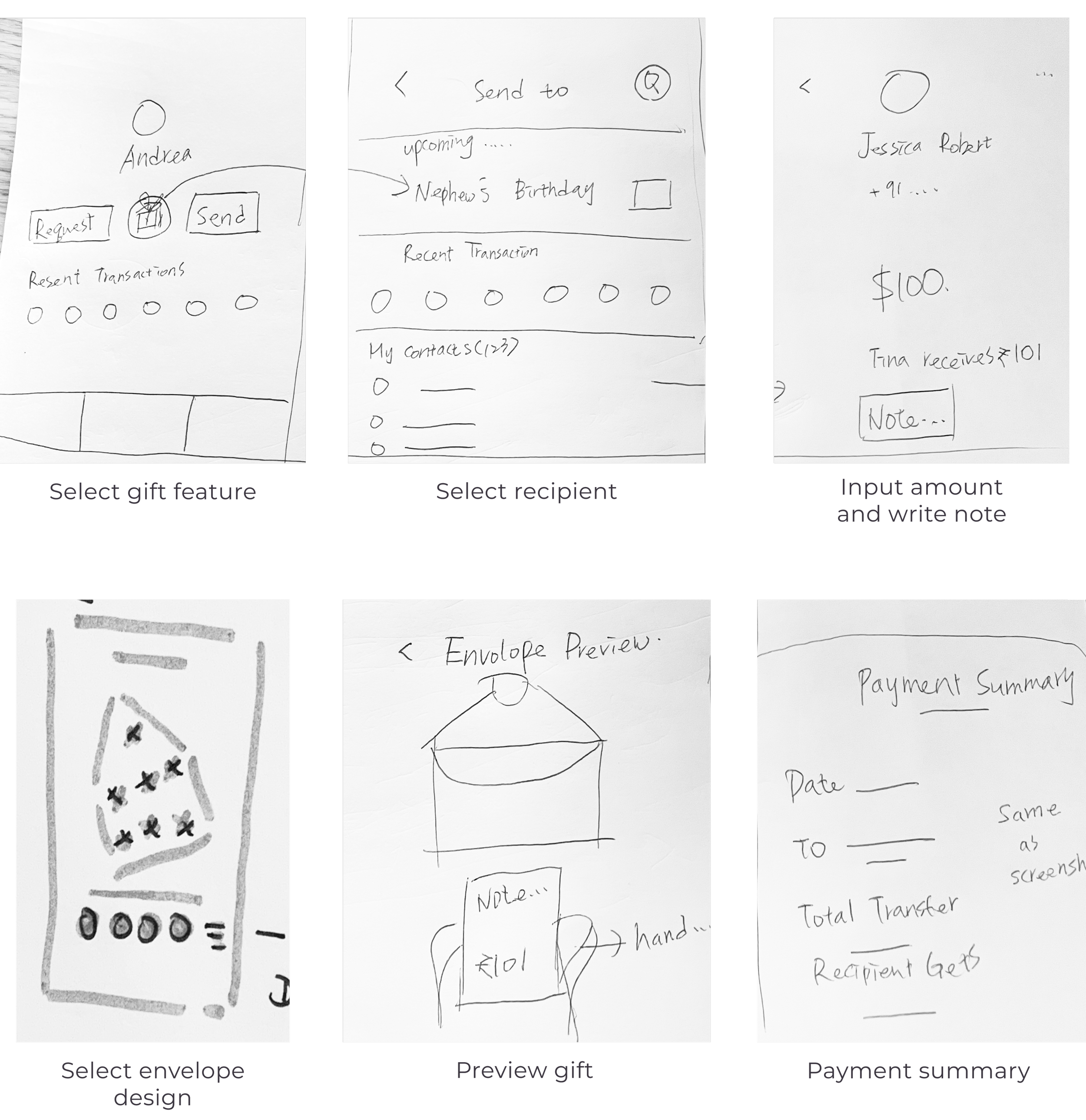
User journey

Prototype and testing
Mid-fi wireframes
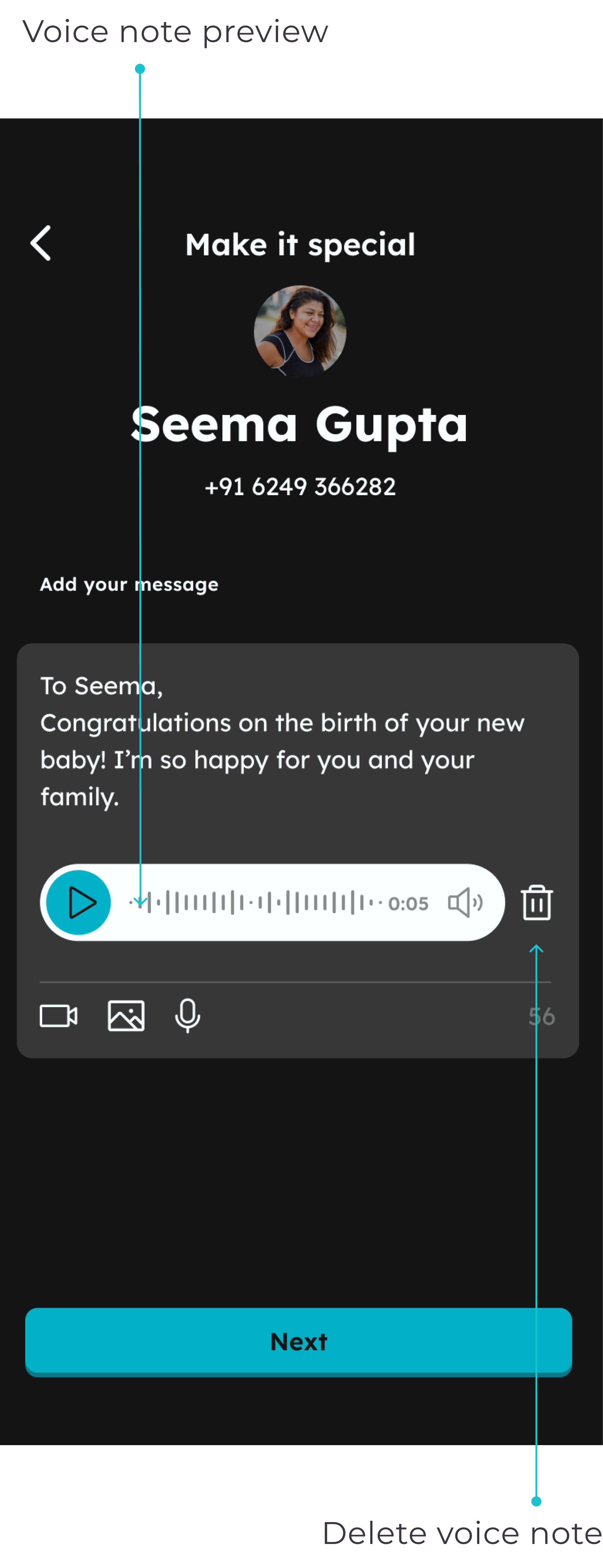
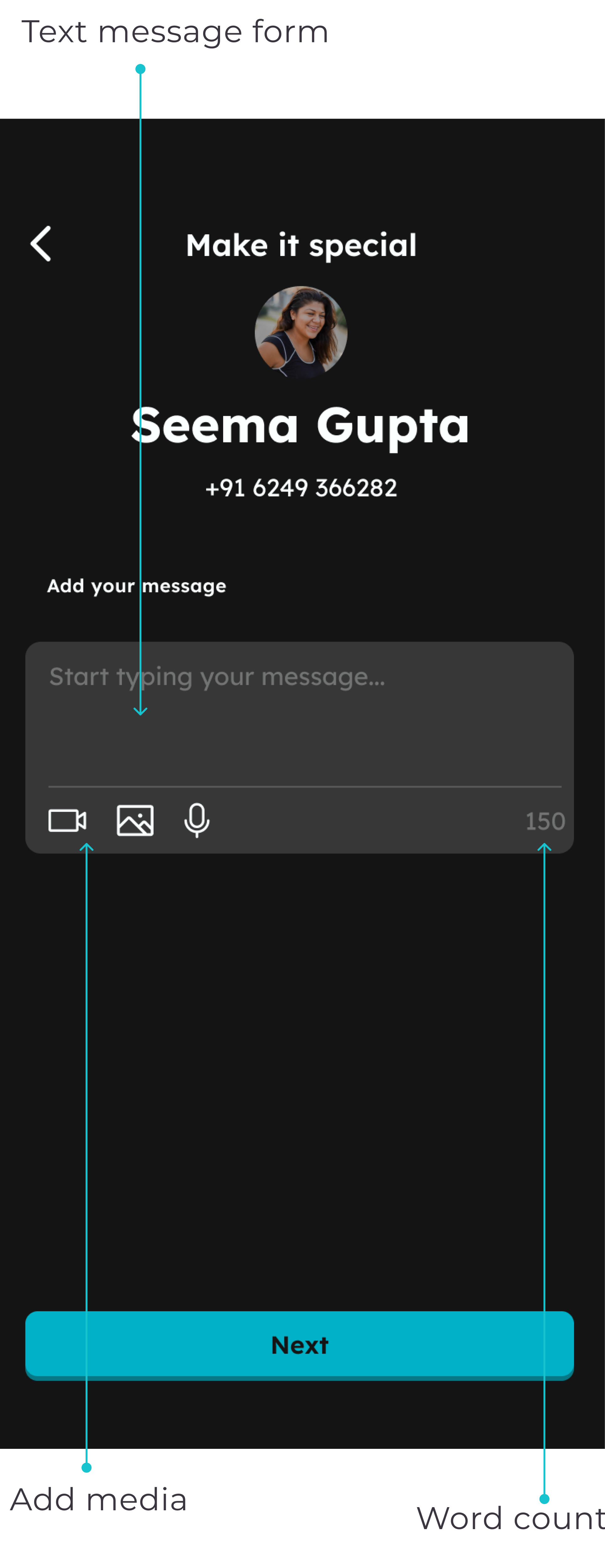
Whilst building the mid-fi prototype, it was clear we now had the scope to include the video and voice note ideas within this envelope feature. This was exciting as we felt it further optimises the user's experience.
Another excellent benefit of this is that in India, when you are gifting someone cash, it's also a tradition to give a blessing, and we thought this could be an excellent way of bringing that online.
Testing
Including these additional features in our mid-fi prototype was a great way to test the desirability and ensure the users understood these icons' meaning.
After testing, our challenge was to style the wireframes in a way that aligned with the existing visual identity that had been established.
Design
UI Audit
To ensure a cohesive UI experience for our users, we performed a mini UI audit encompassing all of Unplex’s touch points: website, WhatsApp, and app.
During this evaluation, I discovered that multiple similar colours were being used. Considering the ongoing development of the app, we used the colours from the live website as our reference.
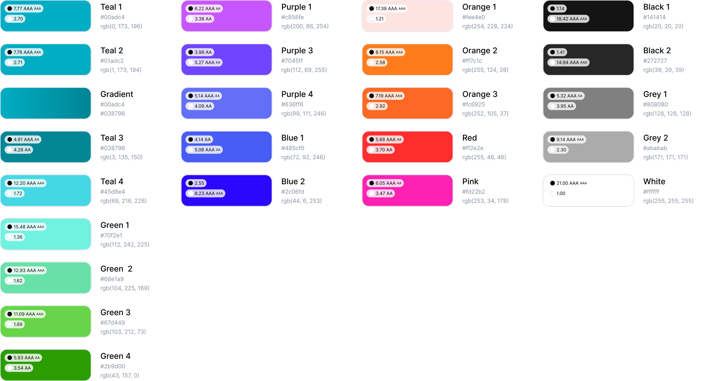
Original colours
It is crucial to establish colour palette uniformity early on to avoid lingering legacy colours within the design documents. Given that various teams are already working with these files, maintaining consistency is crucial for effective UI management.
I also suggested avoiding the use of gradient colours to maintain brand consistency when users are directed to the separate payment and registration processes. As a reminder, during early tests, many users expressed concerns about feeling like they were being scammed, which could be attributed to the inconsistency in the UI design.
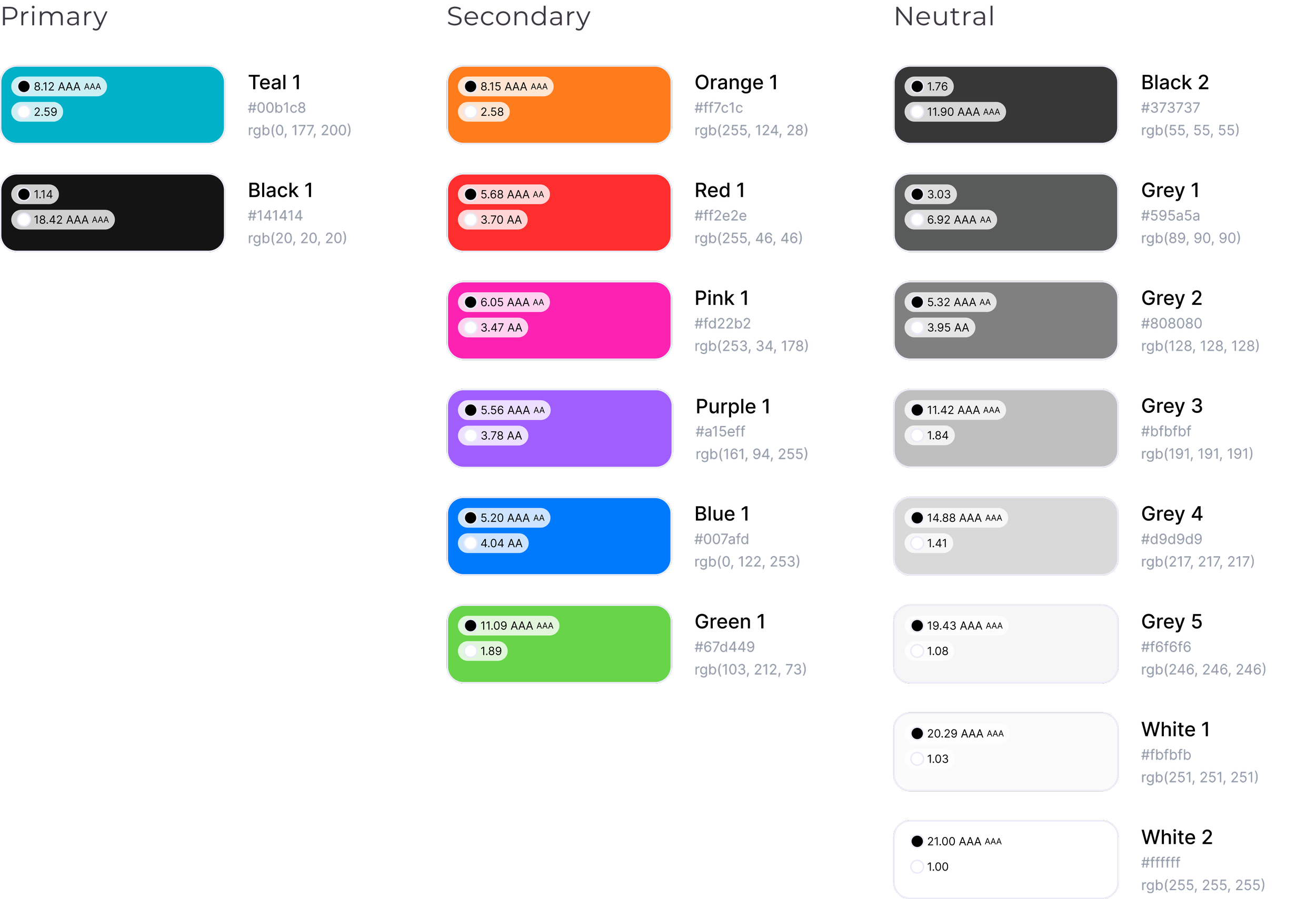
Recommended colour pallet
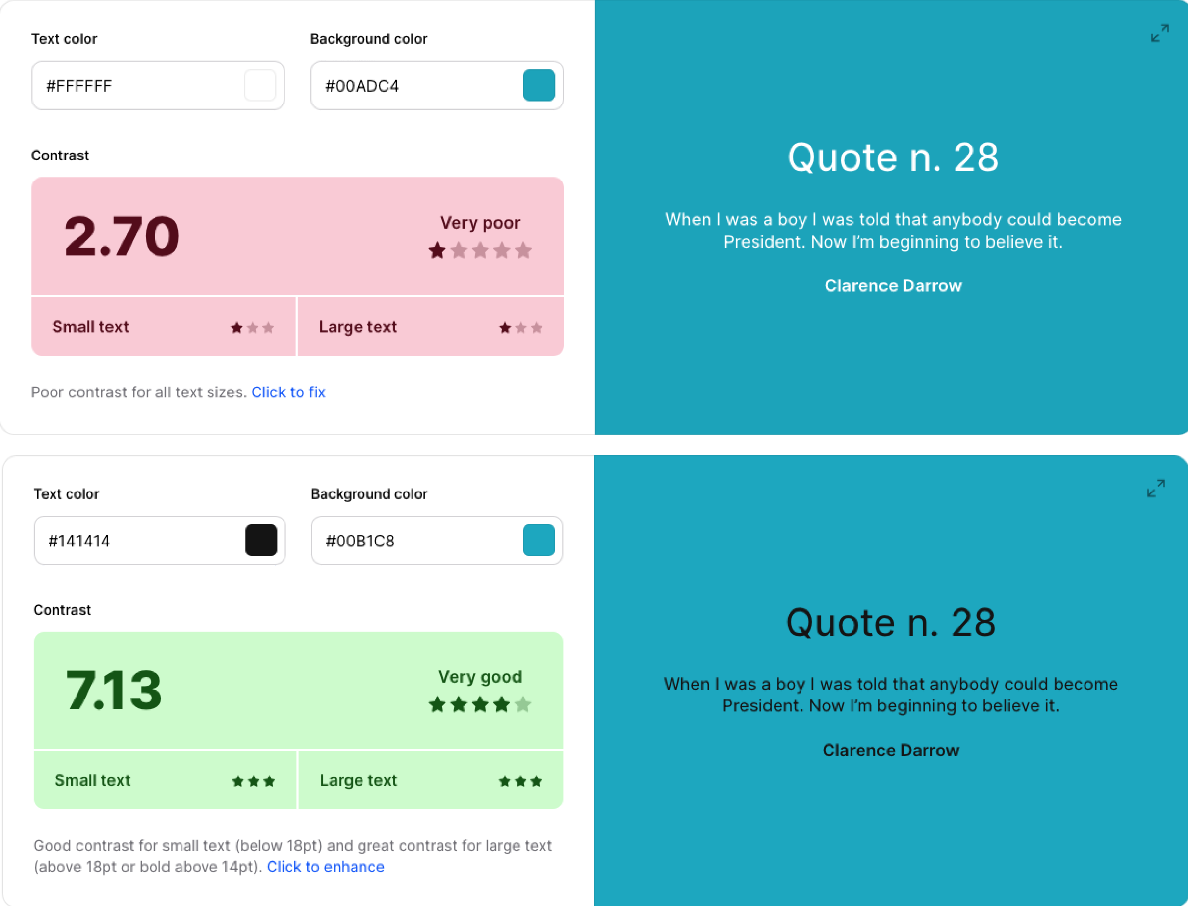
Accessibility
Ensuring accessibility for all users is crucial. To address this, we conducted an accessibility test on the existing CTA style, which unfortunately failed. As a solution, we made slight adjustments to the teal colour and changed the text to black, resulting in a passing score of 7.13 on the accessibility test.

Hi-fidelity development
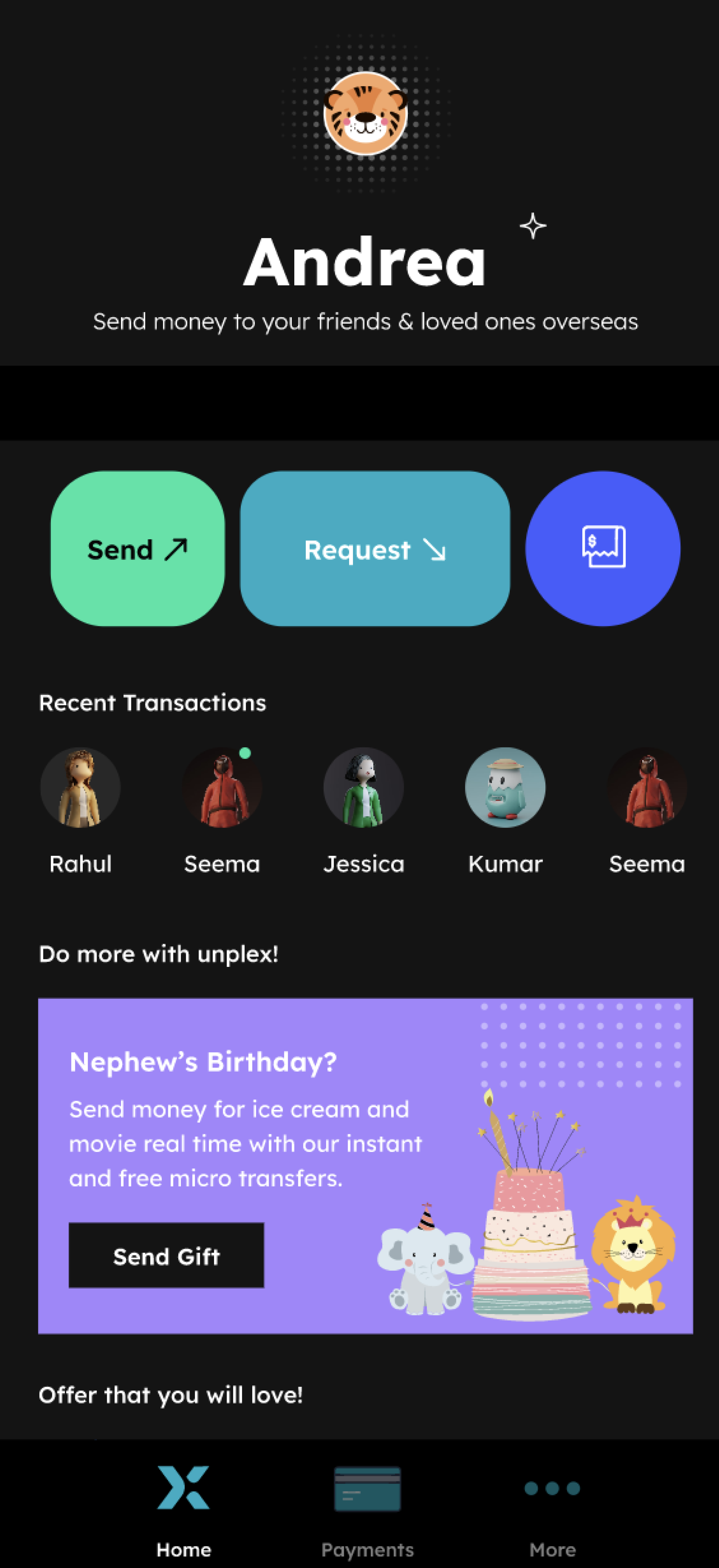
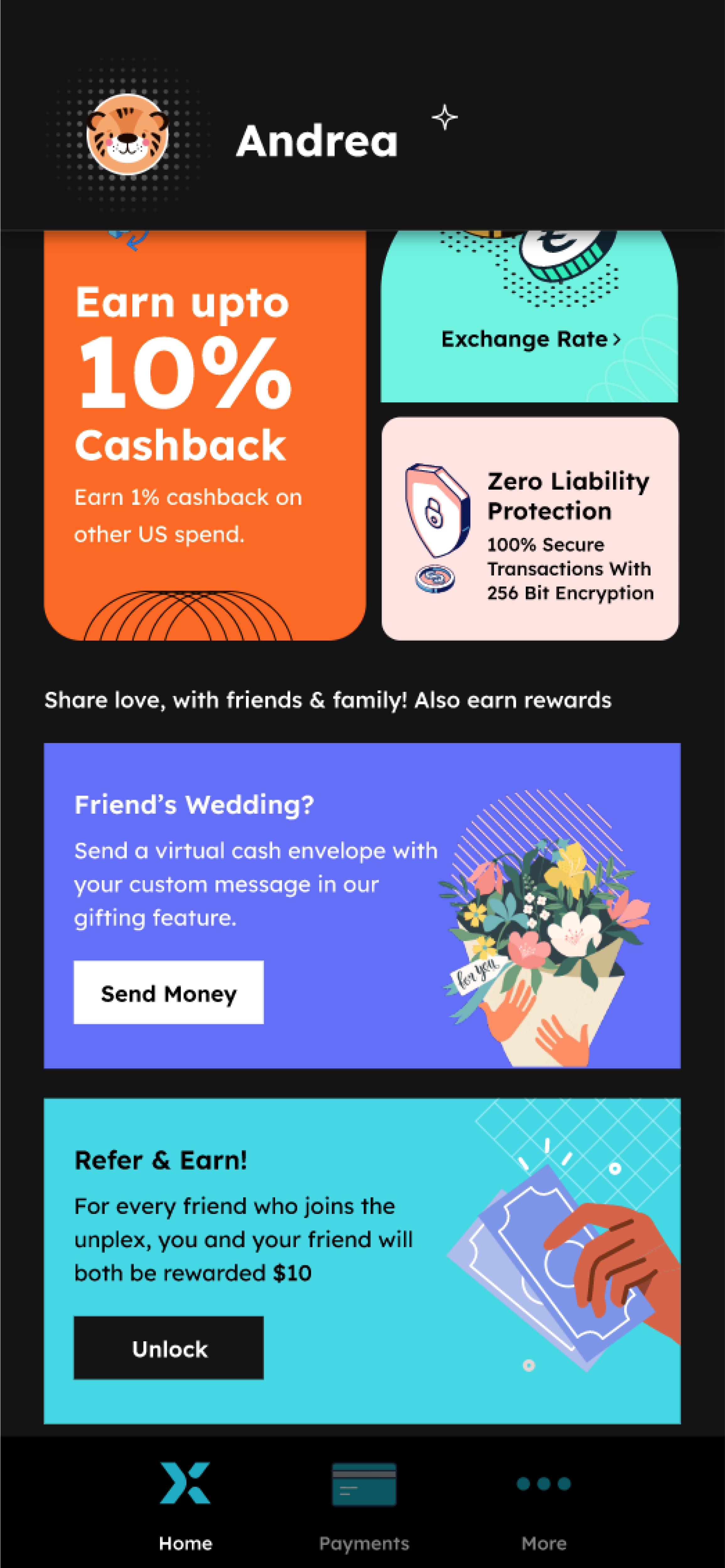
Home
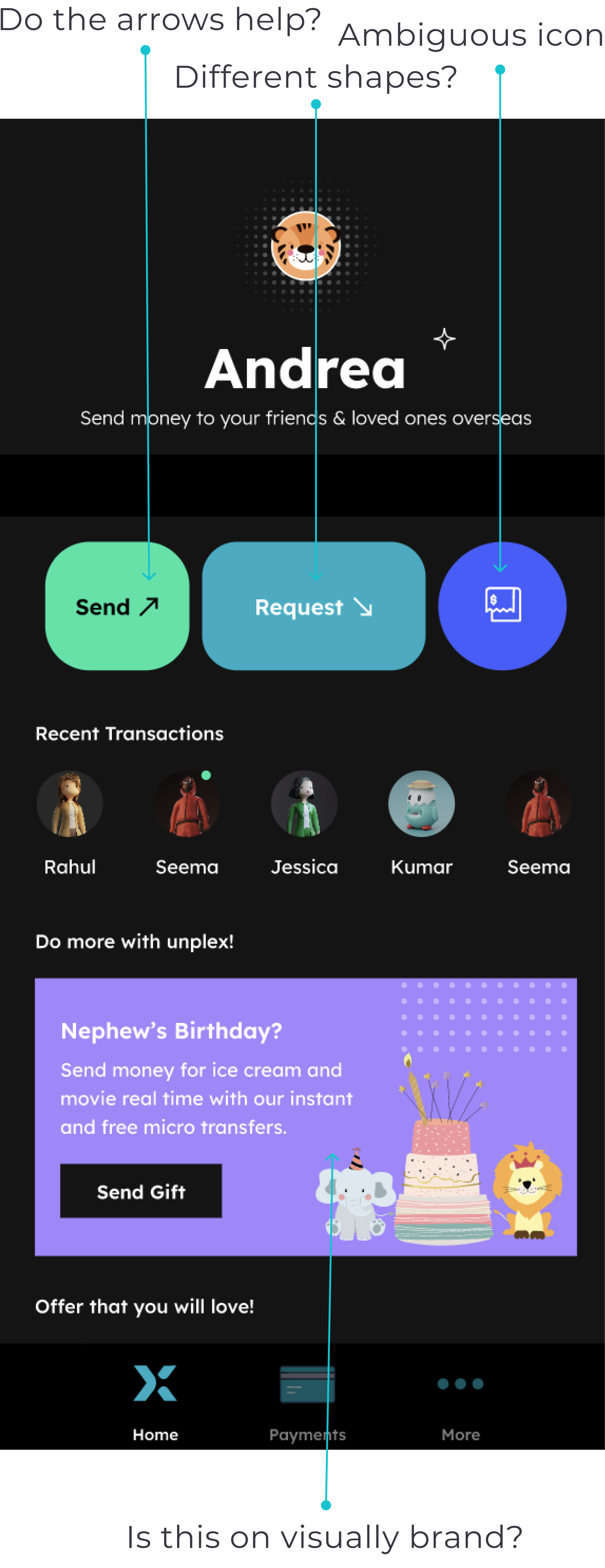
Original
Reccomended
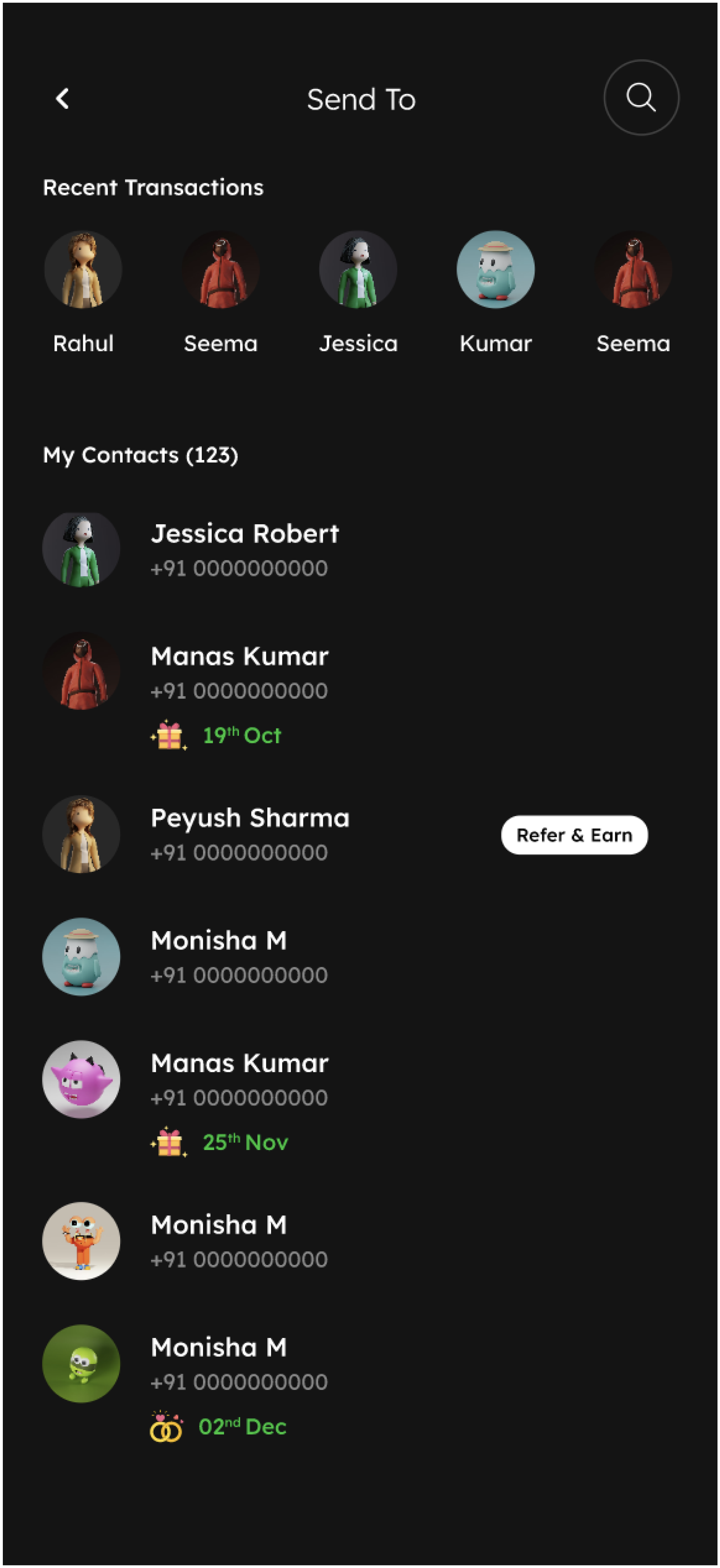
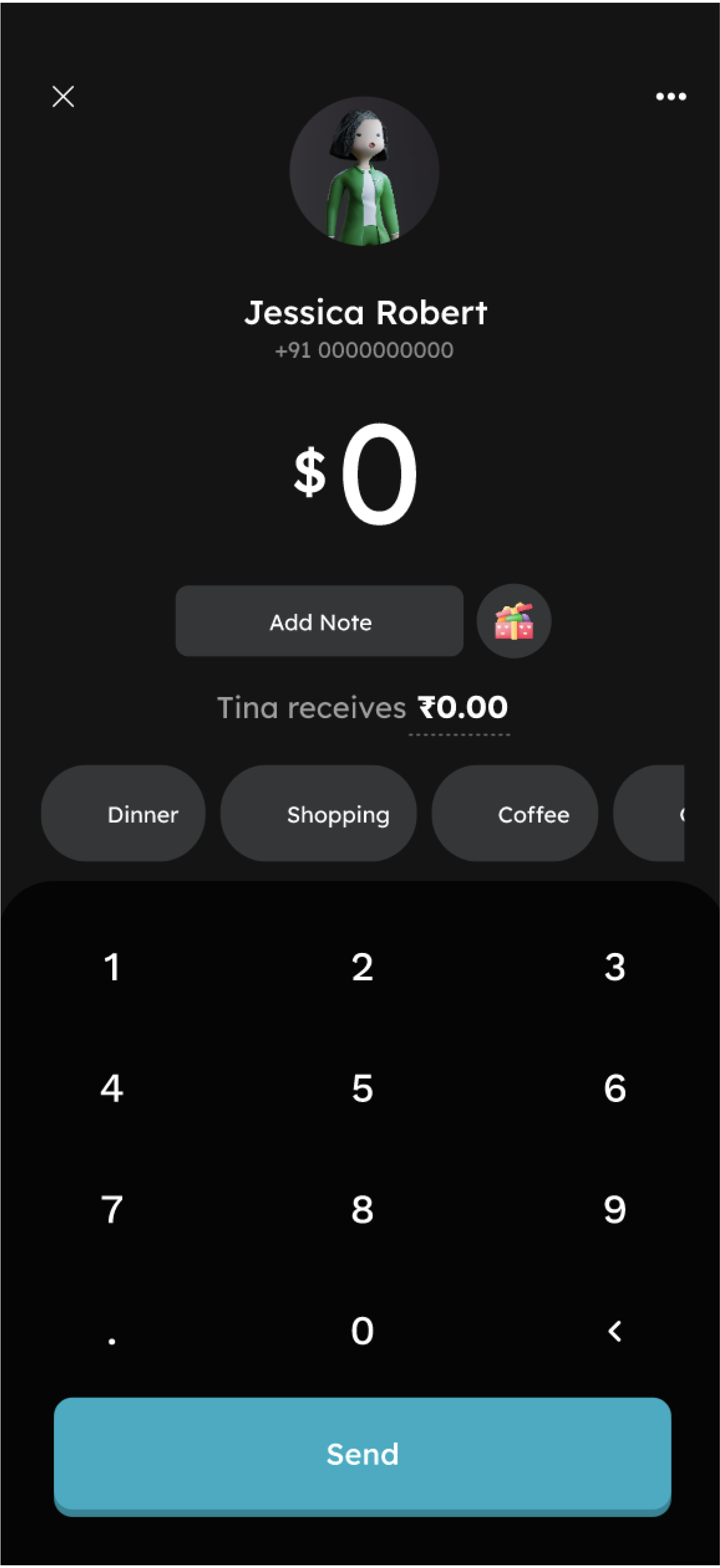
Send
Original
Reccomended
Payment
Original
Reccomended
New message feature

Designing a unique
gifting experience
The mid-fi prototype helped us confirm the desirability of our gift card concept. Now, we had the chance to craft a visually captivating and engaging experience. Since this project was speculative without budget constraints, why not use the opportunity to be daring and creative?
I developed a gift card mood board, aiming to provide users with a delightful and surprising experience, establishing Unplex as the ultimate money gifting app.


Hi fidelity – gift card concept
Project reflection
Our designs received an enthusiastic response from the client. They were genuinely excited about the potential offered by the 'gifting' feature. What stood out to me the most was witnessing their engagement with the user insights gathered from interviews and usability testing throughout the entire process. This marked the client's first experience with qualitative research of this kind, and they quickly grasped the value of testing hypotheses early and often within a design process.