

Blueberry Toys
Enhancing the Online Shopping Experience for a Local Toy Store

Project type: Concept
Team: Solo
Sprint time: Two week
Project summary
Problem
Blueberry, an independent toy store, aims to enhance its eCommerce website by prioritising hand-picked quality over quantity while preserving its "small shop" charm. Despite high traffic, users fail to complete purchases. Maintaining face-to-face contact with customers will remain their top priority.
Process
Qualitative research, like user interviews, played a pivotal role in comprehending the shopping behaviors of our target audience, particularly their online purchasing habits from independent stores. Additionally, quantitative data and metrics, such as card sorting activities, were instrumental in organising the shop's inventory logically and systematically.
Solution
I incorporated a click-and-collect feature and a fast checkout process to help increase sales revenue for the local toy shop. I also created an additional business concept by introducing a ‘stay & play’ event as a marketing and sales opportunity.
Impact
The site's information architecture allows users to search, select and find what they are looking for quickly and easily. The site also provides recommendations and ideas to encourage ethical impulse buying.
Both digital features enable users to checkout easily whilst supporting and encouraging face-to-face moments with their customers.
My role
I added a click-and-collect service and streamlined the checkout process. I also introduced a ‘stay & play’ event to boost marketing and sales and enhance face-to-face customer interactions.
Planned and conducted research from user interviews and competitive/comparative analysis
Conducted a card sort activity to inform the information architecture of the site
Created sketches, designed wireframes, and made prototypes to test with users
Iterated the design from usability test results to produce a high-fidelity prototype

Who are Blueberry Toys?
Blueberry toys is a local toyshop situated in the quaint village of Wokingham, Berkshire. A year ago, Blueberry saw an opportunity to support the local community by allowing people to order some products online. They have plenty of website visitors, yet few completed purchases. They want to showcase their products through an improved eCommerce website while maintaining their brand image: “small shop” appeal and great customer service.
Unlike eCommerce retailers like Amazon, Blueberry offers a highly curated inventory focusing on hand-picked quality over quantity. The highest priority will always be given to their face-to-face contact with customers.

Competitive and
comparative analysis

I began the Discover phases with competitive and comparative analysis. Comprehending and having a clear grasp of the competitive landscape is an excellent initial step for any project. Gaining a strong understanding of a market or sector at an early stage allows you to expand your perspective and discover distinctive or overlooked opportunities that can be further developed and enhanced. I conducted a task analysis of two websites selling similar scandi-style wooden toys to Bluberry Toys. One is a small independent shop thelittleark.co.uk, and the other is a larger retailer, scandiborn.co.uk.

Task analysis
The comparisons showed that Scandiborn, even with significantly more products, had optimised the top nav and logically arranged their inventory.
Using Millers' law and the idea of chunking content into manageable segments enables a content-heavy nav bar to effectively guide the user quickly to what they want. In comparison, when conducting the same task on the ‘The Little Ark’ site, I initially missed the small search icon on the far left of the page, and the main nav bar only enabled me to search by ‘Brand’. Not knowing what brands would sell a toy kitchen became a frustrating guessing game.
Pluses and deltas
I concluded the competitive analysis with pluses and deltas to obtain what was being done well and what could be improved on both websites.


Discussion Guide

Validating or invalidating my assumptions is critical to any discussion guide goal.
In this project, I assumed that people:
Choose Amazon or other well know, big brands out of ease and price
Are prepared to pay a premium for local independent goods
Expect unique items
Expect the local website to be bad
Use Instagram or other sites for present inspiration
I aimed to understand why people choose independent stores over major retailers like Amazon, and what their motivations are for buying local.
I also wanted to understand the significance of sustainability to customers, whether they would be willing to pay a premium, and understand any frustrations they experienced when purchasing toys online.
Key insights
“I use Amazon because of time - It comes up first in search and is hard to beat on price, postage and choice.”
Participants validated my assumption that people use Amazon for ease and price but also detailed that postage cost and choice/quantity of products available was a big reason for shopping.

“I tend to buy nice toys as presents, so I’m likely to spend more.”
Participants were likely to buy second-hand from Facebook marketplace or charity shops for their own children. In contrast, they enjoy buying a unique or trendy gift for friends or family.

“Shopping local and sustainably makes me feel like I’m doing good. Not just for the environment but as I’m supporting real people too.”
Participants liked the feeling of shopping locally as they felt like they were having a wider impact on their community by helping small businesses to grow and flourish. This feeling was enriched further when buying sustainable items, especially toys, as it gave them a sense of satisfaction knowing the gift could be handed down or passed on.

“It takes more effort, research and time to shop local.”
Going to buy at a physical store takes more effort; you need reassurance that there would be plenty of options to make the trip worthwhile. Participants also mentioned planning and saving in advance. For example, customers suggested buying several toys in three for two deals - giving them a stash of 'present' toys ready at home for unexpected parties.

“As a new mum, I like going to the high street just to get out of the house”
Likewise, going out to the high street becomes a much-needed daily or weekly activity for new mothers wanting to break up their day. A somewhat ordinary activity becomes a highlight for them allowing them to dress nicely and feel connected to other people again.

Persona

Becky wants to support her local independent toy store as supporting real people makes her feel like part of her community. But she believes it will take more effort and forward planning to get the gifts she needs.
Problem Statement
How might we encourage Becky to shop with us online and in-store in the most fun and exciting way?
How Might We
Initial ideas

Crazy 8’s
Are an excellent creative exercise for getting rapid ideas on paper as quickly as possible. It takes away perfectionism and lets lateral thinking ideas bounce onto the paper. All you need to do is set a time limit (one minute) per idea. Due to time constraints, I created some crazy 4s designs instead.
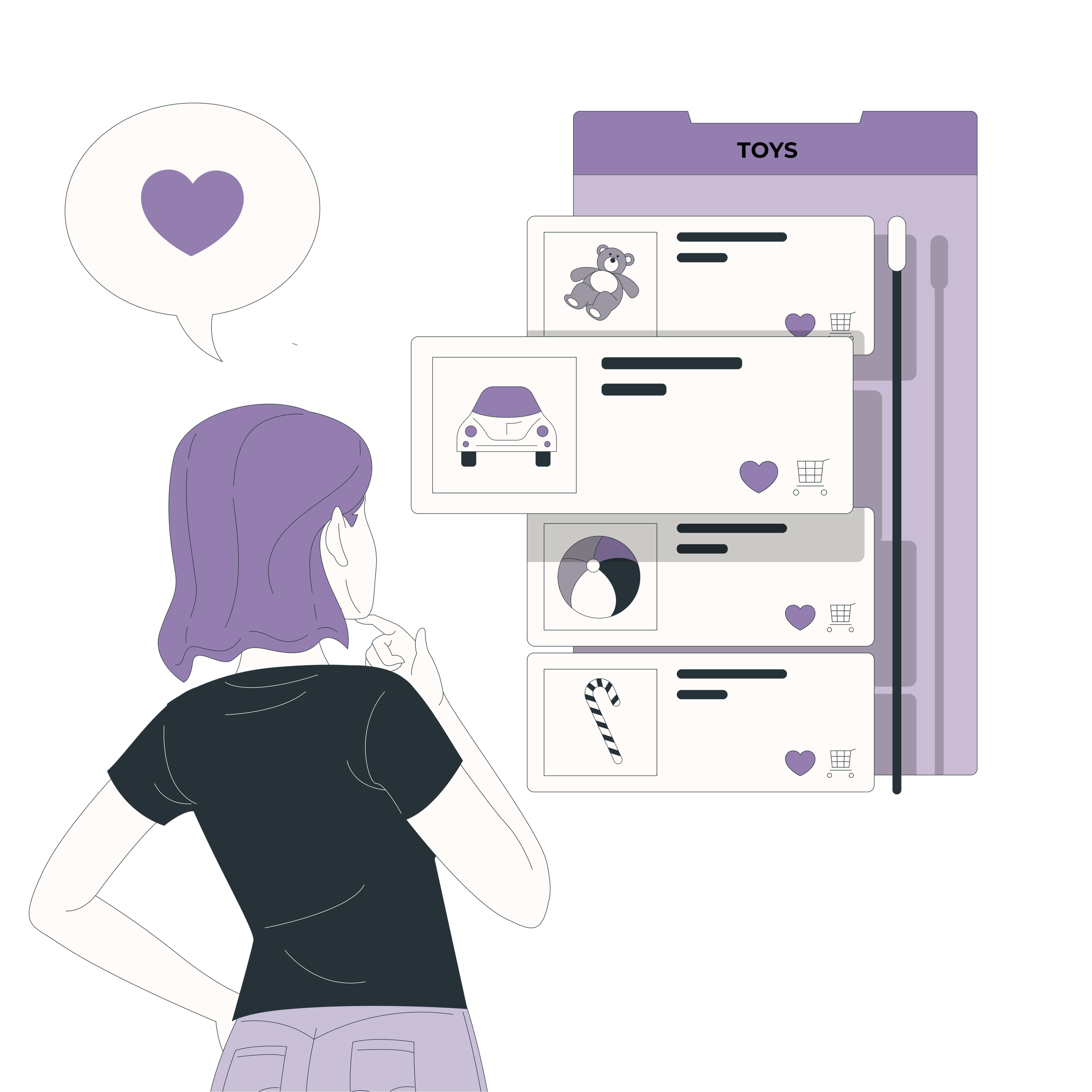
Ultimately focusing on two features: a click-and-collect option for Becky to combine leaving the house with picking up her orders and a "stay and play" activity/event session where parents can try out toys with their children before purchasing.

Card Sorting and Site Map


I conducted a card sorting activity with users on Optimal workshop to organise products into clear categories and structure the site map accordingly. Clear categories were denoted via the dendrogram, and a similarity matrix helped clarify these groupings.
Site map

User journey (Selecting rainbow toy cake)


Wireframes and Prototyping
Home

Product page


Selected product page
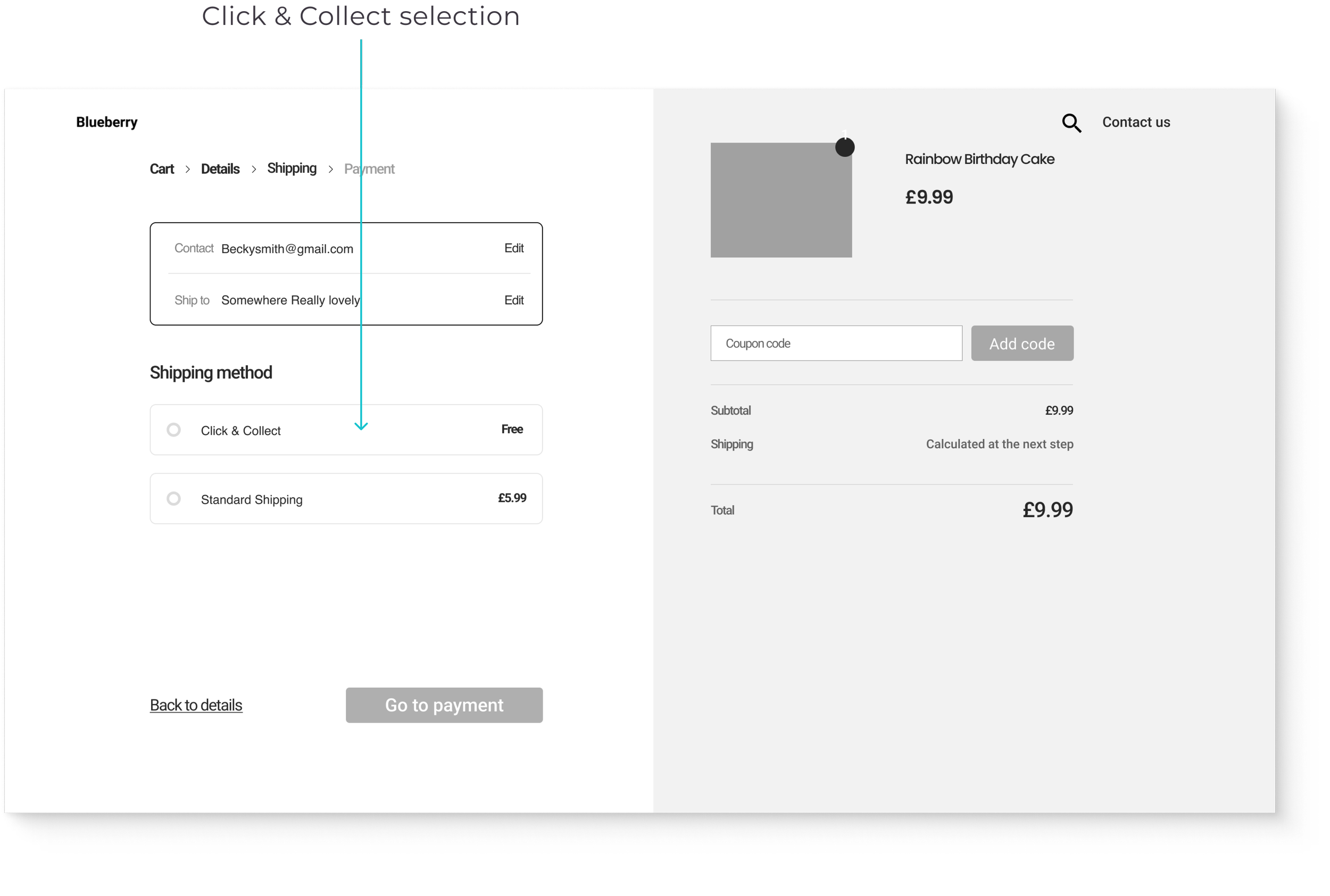
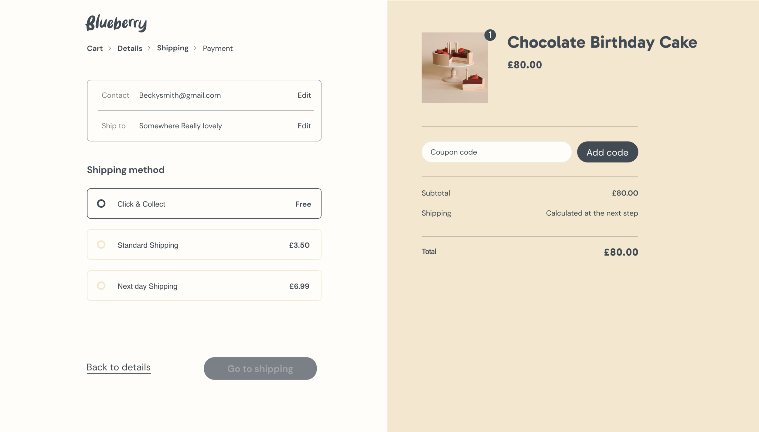
Check-out

Usability testing
Mid-fidelity wireframes were created and tested to validate the navigation, assessing if users could find and purchase a toy kitchen alongside gathering feedback on the desirability of the click-and-collect and stay-and-play features. I conducted moderated, remote usability testing via Zoom.
Overall purchasing experience?
Testing objective:

Desirability of ‘click and collect’ service?
Testing objective:

Desirability of the ‘Stay and Play’ feature?
Testing objective:


Visual design brief
What are we making?
An e-commerce website
Why are we making it?
To improve sales online and instore
Problem we’re solving
Increase the ease, convenience and desirability of shopping locally.
Unique Sales Point
Selling a curated selection of Scandi style toys, Blueberry Toys prioritise hand-picked quality over quantity while preserving its "small shop" charm.
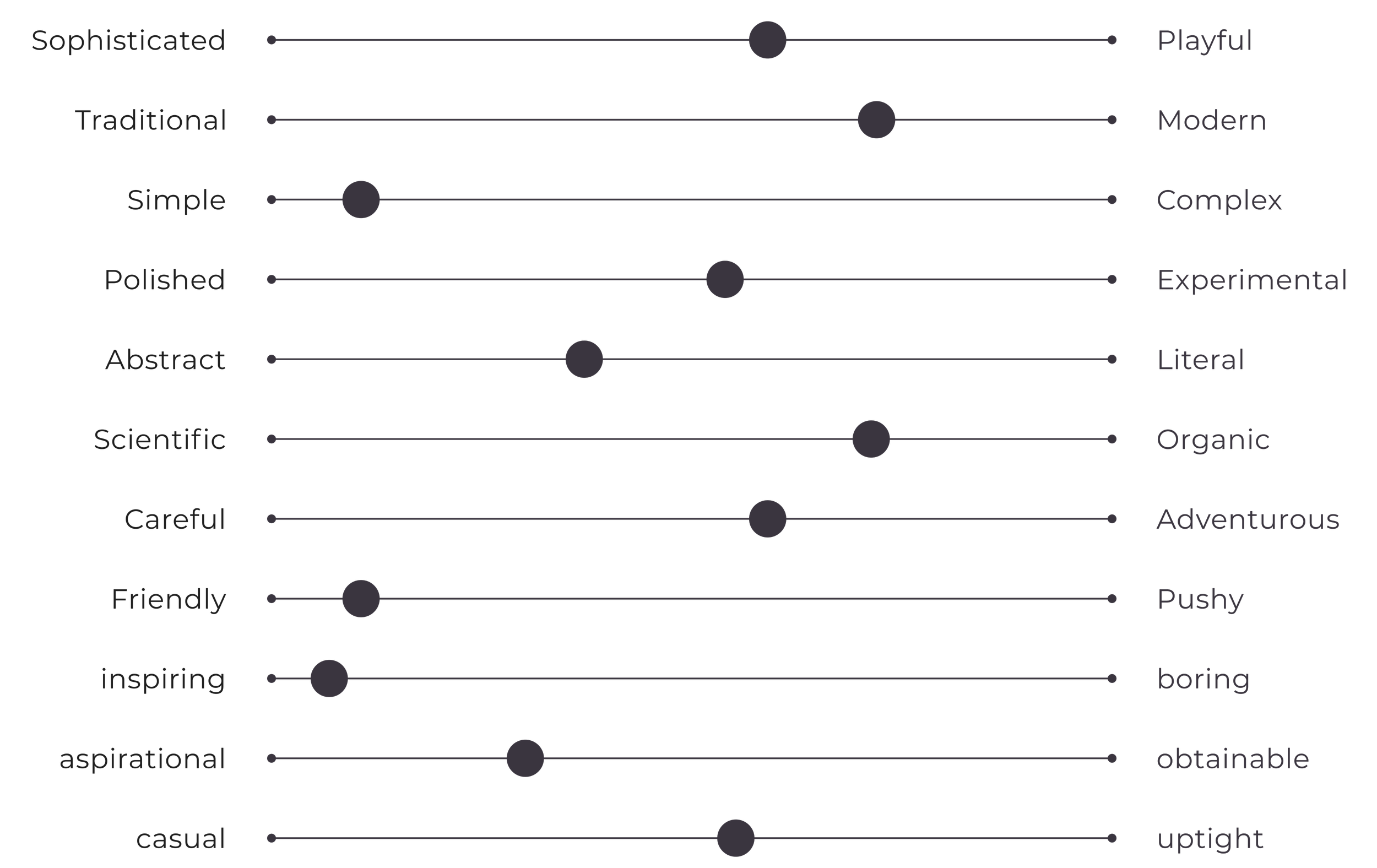
If this brand were a person, what would they be like, and how would they express themselves?
They would be trustworthy, modest, vibrant, accessible, compassionate, and friendly.
UI mood board – Scandi toys
Style and Colour
Mood board


For colour, I chose a selection of earthy yet vibrant tones conveying the sustainable nature of the brand.
Colour palette


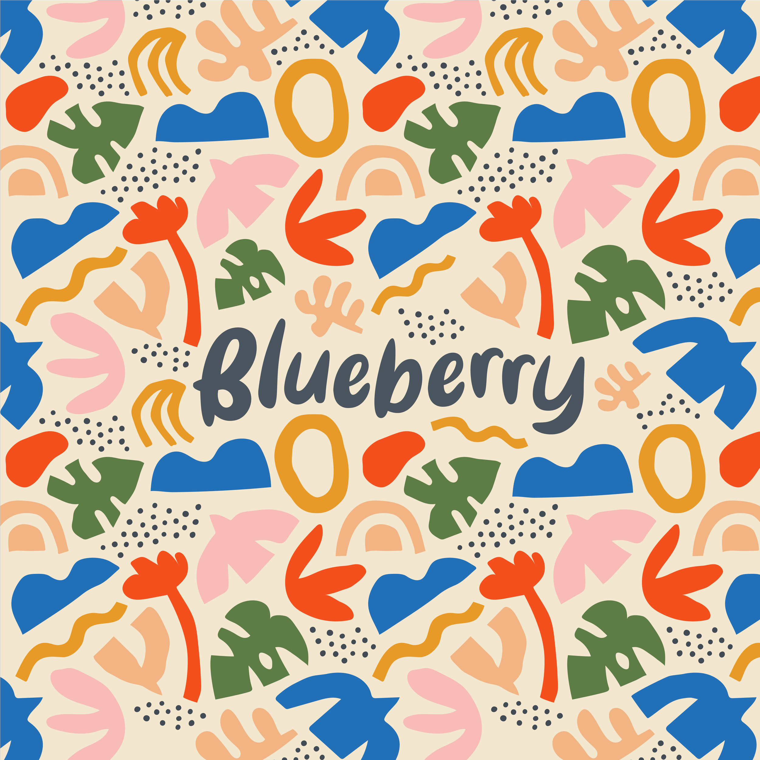
Logo development

When searching for an authentic handwritten typeface, I stumbled upon 'Special Argument Letter,' and initially, I thought it had potential (despite the name!). However, it turned out to be a bit too rough for the brand's identity. The letterforms at the end of the 'e' and the connecting element at the edge of the 'b' were too square and sharp for what it needs to convey.

‘Bestina’ exuded a friendlier vibe with its smoother, rounded shapes. However, it appeared a bit too pristine and flawless for our project, lacking the natural wave-like shapes found in 'Special Argument Letter' that are created with a script typeface. Additionally, the excessive negative space around the two 'rr's was distracting and made the logo feel unbalanced.

I began experimenting with 'Bestina,' making adjustments like pivoting and resizing individual letters. When undertaking such modifications, it's crucial to maintain the overall balance of the letterforms. It became evident that I needed to reduce the weight of the 'B.' Since this letter was transformed into a shape, I found the 'Offset Path' tool in Illustrator invaluable for swiftly and effortlessly adjusting the shape's width.
The Logo
Introducing illustrations & patterns
At this point, I started considering the brand's visual identity from a holistic perspective. I realized that a custom pattern design would be ideal, but given practical constraints in terms of time and budget, I turned to Creative Market for a solution. I came across the 'Organic Shapes' pattern, part of a collection by Dedraw Studio. It's crucial to ensure that you purchase the appropriate commercial licenses, which should be based on the size of the company you're working with and how the visual identity is going to be used and distributed.
Design application


Digital

Hi-fi Wireframes
Home

Nav dropdown

Shop now

Product category

Product page

Check-out
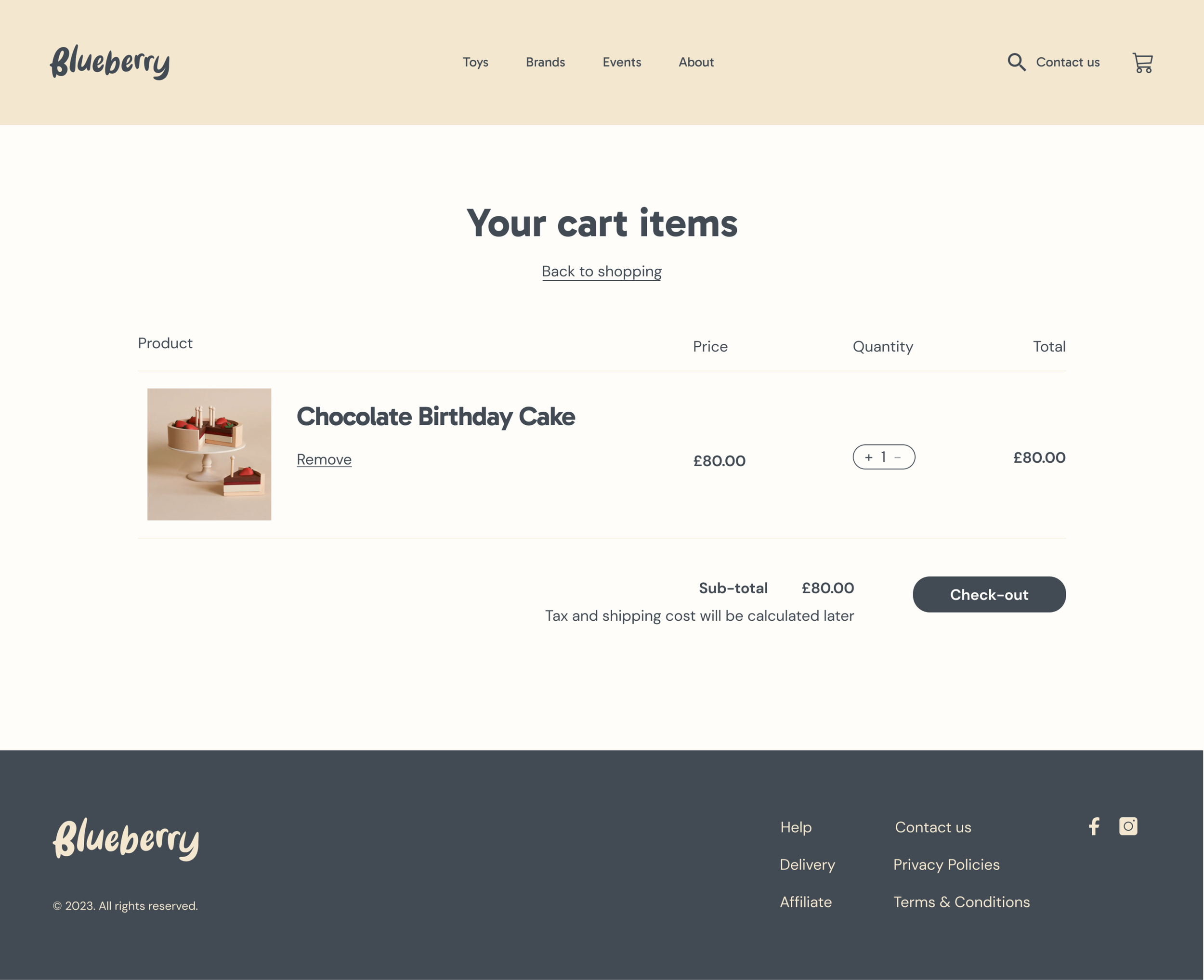
Click & Collect
Project reflection
Next steps
I would develop the Events / Stay & Play page. In the usability testing, participants said they expected to see a calendar that allowed them to set dates and book sessions. I would also consider adding product reviews and further refining the high-fidelity UI design after the initial site launch.
Key learnings
By conducting thorough user research, implementing user feedback, and integrating features that bridge the gap between digital and physical shopping experiences, Blueberry Toy store now provides a curated, sustainable, and enjoyable online shopping experience while maintaining its small shop appeal and excellent customer service.